This is an archive page
These template versions are no longer available for purchase
Go here for the current version and to buy some.
The 2012 version of the Touch Template (especially) was very crowd-designed. I originally tried to get it on Kickstarter, but for some reason they don't like it.
So, I did it myself. The rest of this page is all the content I put up to explain it originally, and shows the process of the template evolving over time as others gave their input, or even sent me variations of the design document.
For the newest version, or to buy one, see the 4ourth Mobile Touch Template page.
I don't get it, what's the point?
Designing mobile interfaces, or interactions, is all about making stuff actual people can use in their daily lives.
If you keep this in mind, and use some guidelines, especially specific to mobile interfaces, we applaud you. But most guidelines involve measuring in Photoshop, or Fireworks. Measuring sizes and spaces in pixels. And, measuring with digital tools, on laptop screens. Not in the real world at all.
Your finger cannot be measured in pixels. Your eyeballs see photons, not pixels. And more or less of them depending on how far away you get from the screen. We need to set aside the 44 px cadence, and any other guidelines that are resolution dependent. We need to get off the computer, and try things out on real devices.
Developers of mobile sites, or apps, say "you aren't testing, if you aren't testing on the device." Well, the same is true for designing and specifying interactive elements on the screen. You should already be taking your wireframes, or Fireworks templates, and exporting to raster images. Send them to the device, and just look at them in a photo gallery. You can even get surprisingly good "paper prototype" like user test results with this.
But first, you just look a it. And measure, and try it out. Since the dawn of the mobile internet, at least, I've been peering at the screen and using the typographers scales designed for print design – plus lots of math – to determine what size is actually displayed, and what works best.
With ubiquitous touch, another facet became even more important to measure, and the concept of touch targets, and avoiding accidental input became crucial. Besides reviewing lots of existing work, I did my own research a few years ago, gathering fingertip sizes and accuracy from a bunch of people. I have determined and validated the best guidelines for both of these. For a few years now, I've been carrying around a generic circle template to measure the proper spacing, and determine when user errors are the result of true interference.
As mobile design matures, I think it's past time that we deserve our own tools. While some drawing tools exist, there are no inspection tools. There's no equivalent to the pica sticks, type scales and other measuring, evaluating and approving devices the print world had.
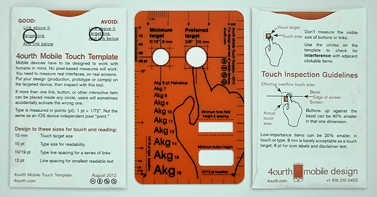
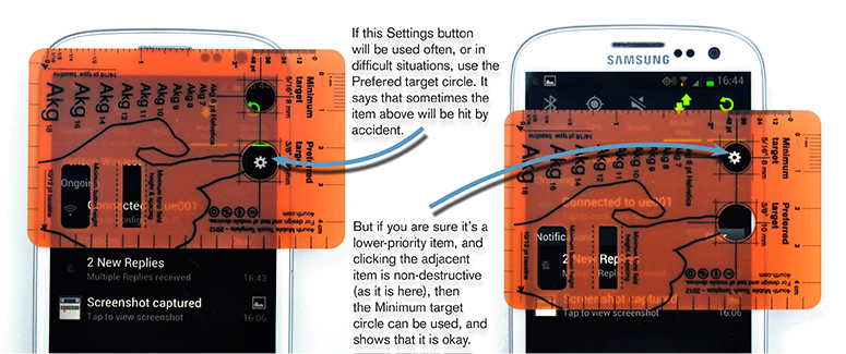
So I've made this. A dedicated inspection tool for mobile devices, and especially for touch devices. The circle in the middle allows you to quickly measure if there will be interference between touch targets, and a larger inscribed circle is for high-priority targets. Note that in the photos, the larger circle is not very visible, due to the way the prototype was built. I am more disappointed than you are, but this will be very much fixed in the final production run.
You don't have to buy this product to get the touch guidelines. They are all published in my book Designing Mobile Interfaces, and shared for free on this very wiki, over on Human Factors & Physiology. The summary view and touch guidelines are at the very bottom of the page. 10 mm or 3/8" is the suggested touch size, if you were wondering, and 8 mm is the minimum size, which is also the cut out circle in the middle of the stencil. Maybe I should re-label that to "minimum" instead of "standard." What do you think?
A rule down the right side is calibrated to the suggested minimum type size, and line spacing. And just like the touch target, there is a larger suggested size scale along the bottom edge. Rulers along the other edges allow more direct measurement. The whole tool is transparent, making measurement of small items easier by removing parallax. You just put it right over the thing you measure, and look straight on, through the template.
The whole tool is the size of a business card, so you can keep it with you wherever you go. That also makes it about the size of a handset screen, so we've added a few additional cutouts to the empty areas. You can use it to draw key elements at the right scale, as a prototyping or sketching tool, wherever you are. Bring a pen, and you can draw on napkins.
What the final product is:
It's going to be a stencil, like a plastic drawing stencil, used by draftsmen and so on. It will be made of tinted plastic, with cutouts, and heat-stamped words and lines to explain the use and add additional features (like the various type scales and mini rulers).
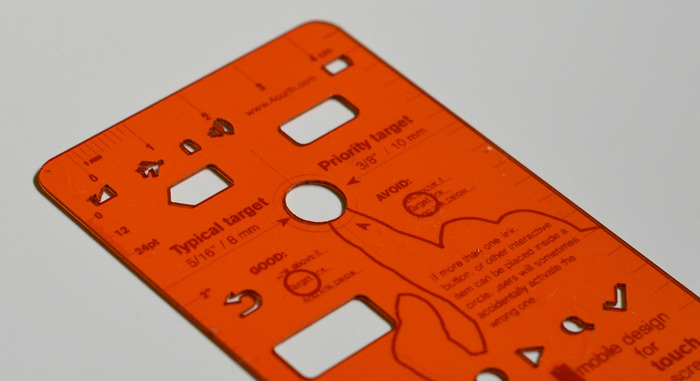
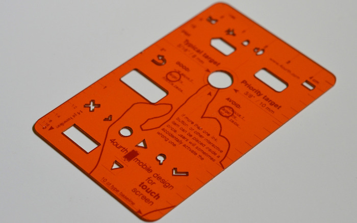
The prototype that is shown in all the photos and videos here is laser cut, and laser etched. It is the same material, but produced in a different way. The printing will be much, much more clear in the final product. Printing will, in fact, be black, instead of the darker orange on the prototype. Printing will be on the back side also, to reduce parallax errors, when you are trying to measure very small things. In addition, I have to re-draw it slightly, as the cutouts don't really account for the size of pencil tips, or even just manufacturing processes.
These are quite sturdy products. They should be nearly impossible to crimp or break, and take quite a bit of abuse to even scratch up enough to make too opaque to see through. This is something you can carry in your briefcase, or even your wallet, for years and have available whenever you need to check out a product, or talk about the pros and cons of specific design approaches.
Prototypes:
I have a few of the prototypes which I used in the photos. Give me $100 and you can have one to play with (and photograph it and talk about it all you want). Please, if you do this, try to use it and provide specific feedback to the group discussion about any changes we should make to the production template. Or just confirm it is fine and I am brilliant. Note: It's not fine.
Yes, it's yours forever to keep, plus of course I'll send you a real one when the production items arrive. I'll even overnight it if you want it right away, though of course this will cost me more money (out of your fee), so that's your choice. The $100 is a semi-arbitrary amount of money, about twice what they cost to get made, all up. You are also saying how much you like and support the idea.
But be aware, the prototypes are, well, prototypes. The are not all that great. The drawing portions aren't big enough to be really useful yet (my mistake), lines and words aren't always visible, and some of the lines aren't lined up with the cutouts. It is good to get something physical, but it also helped prove that I cannot rely on the flexibly-scaleable (or custom per user) laser cutting shop, and have to get really stamped out stencils.
It's very much a prototype, so plan accordingly, and do not be disappointed with what shows up.
Digital Files:
I can't just give away pieces of plastic, but I can give away digital work all day, just like I do throughout this wiki. So, here's the latest (and hopefully final) version of the file I used to make it, with all the previously released versions on a second page, and a viewable vector version:
Type is mostly Akzidenz Grotesk. Cause I say so. If you don't have it... tough. It's not free, so nothing I can do about sharing it with you, or anything. Switch to Helvetica if you want, or just let it auto-replace with whatever it does, and let it be terrible.
Aside from that, I have some revisions as well. Check the drawing, and see what you think. I will post more detail on the theory behind it, probably by adding an updates/discussion section at the bottom of the document.
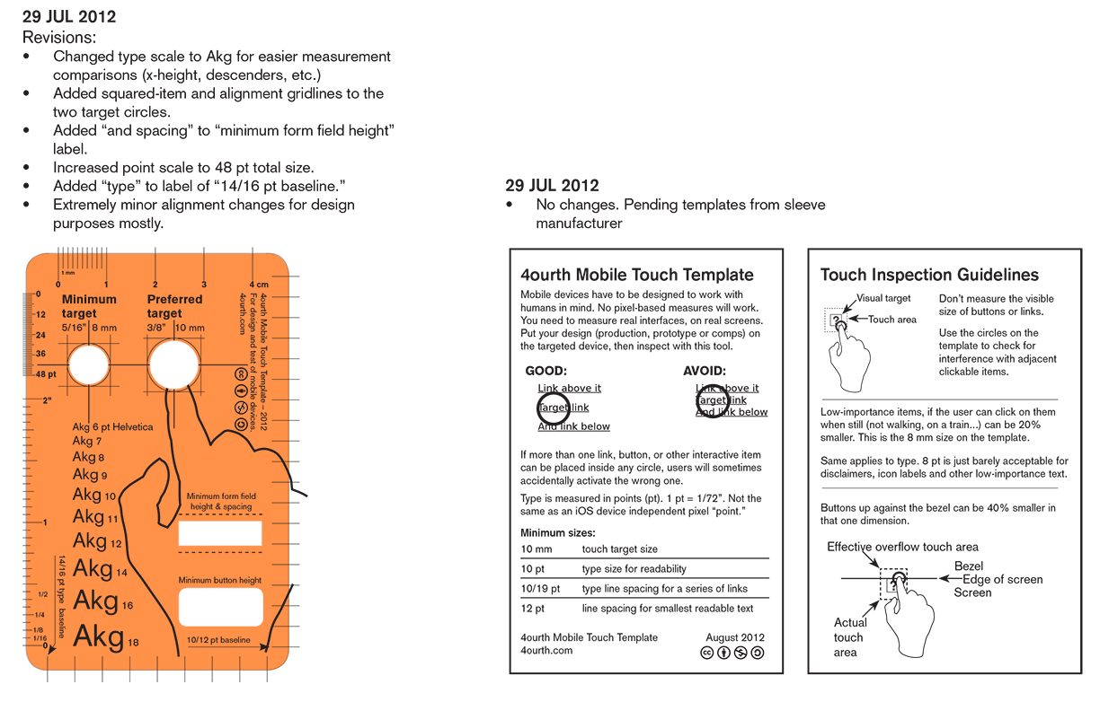
Do note that I don't mind if you even print these out yourself. Well, I'll be annoyed if you try to sell them, but just that. I have deliberately not protected myself very much legally, except for a non-commercial Creative Commons attribution thingy on the file.
But you can print it on transparency, and use it as it is. I did this for a month before I paid for the laser cut prototypes. It's not great, but it's cheap and quick.
Shipping:
I am not 100% settled on the packaging, but will probably be using smallish bubble envelopes to make sure the stencil isn't destroyed by overly-agressive mail handling equipment. If not happy with this, I'll add cardboard inside to keep the stencil safer.
I am pretty likely to also include a tiny 2.5x4.25" envelope that the stencil will slide into. I've been carrying mine in one of these, but it's not itself very sturdy. I hope to be able to find Tyvek versions, or something else more long term, as well as better fitted so it can be kept in there in your wallet, but we'll see what comes up.
Why do I need to "pre-order"?
Because the way I want to make these for real is expensive. Not individually, but you can't buy them one at a time. To make it make any sense, I have to order 500 of them. 1000 would be better.
Time to tell off Kickstarter: It's a great concept. Exactly what I wanted here. I think this is a good idea. But I am not /sure/ there's enough demand to run out 500. And, maybe some part is misguided, and you want something similar, but not identical. So, I want you to tell me, with your wallets. Sadly, Kickstarter decided this was not up to their standards (I presume, it's not shiny enough, nor iPhone/iPad specific, so they couldn't understand it -- but the rejection is very vague so I don't know), so I am doing essentially the same thing myself.
You pre-order, or buy one of the prototypes, and if I get a certain amount of money, in a certain time, I'll make them. The values are both fluid and depend on what you are saying as well as what you send me. If it's massively successful, I may cut off donations to reduce complaints that I took your money and it'll then take months to get them printed and sent out.
Why should I send money to you? Won't you just run to an extradition-free country?
Look, it's gonna be hundreds of dollars. Not enough to run. But mostly, you know who I am. Even if you don't know me personally, or professionally, or saw me speak, look me up. Not only are all my social network contacts out there, but it's pretty easy to find my phone number. Or my street address. Driving directions are on my website.
So, you can find me. And, I've done stuff before. I sell books and T-shirts. I have written and edited for serious publishers. I show up for work and conferences, without fail. Ask around. I am reliable. And I am only doing this because Kickstarter hates me.
People have also seen this. It's been to a handful of conferences; not discussed up on stage, but pulled out to various people in small groups, where I get feedback. Positive feedback. I had to give away an earlier (much worse) prototype to a co-worker, even. So, it exists and people have seen it.
I am in for more than you are
Also, I've already put in a few hundred dollars, and about 100 hours of design, building the laser-cut prototypes and discussing with others. And, I am not going to wait to get Kickstarter money. I am planning on covering 1/3-1/2 of the production costs myself. Unless it's massively successful, I'll just have a pile of these sitting around to sell off slowly, or give away to people I really like.
It took a long time to find a place that makes the right kind of stencils, and would work with me to make a custom stencil. But they still have minimum orders, so I need the money to make that minimum. When I get to these minimums, the price per stencil will be pretty small. Making these affordable enough to distribute widely is key to the concept.
I also deeply investigated other production process. The laser cut prototypes – while useful themselves – prove that there are no other production-grade processes for items like this.
I have also got estimated costs for the packaging, and the mailing. I am not expecting to actually profit, but I did leave a few bucks extra, in case there are extra costs, to cover the planned (but still not found) little sleeves, or I just did the math wrong. Even if we make changes to the design, I'd like to not have to come back and ask everyone for an extra $1 per stencil. In fact, that may be a key principle; even if a bunch of you vote for an expensive change, I will ignore it to avoid upping the price, if at all possible.
Besides cash, what else I need you for:
I have my laser-cut demos, so I am covered for my own stencil needs really. But as you can tell from all the documents I share, and all the speaking I do (and no, this doesn't pay off), I want to spread good information to improve the state of the industry. Here, I'd like to make a product that is useful to the rest of the mobile design community. If you all hate it, there's no point really, so the lack of funding will be the end of it.
If you like it, great, but don't just vote with your wallet. Tell me what you think, and how this can help you. I want you to provide input on any and all details of the stencil. I think I have picked out the most useful and difficult-to-draw shapes, for example, but if you disagree then please tell me in the comments.
This could extend to some of the key attributes. If there's no real need for the drawing part after all, for example, I can drop that and make it more focused as an inspection tool instead.
I recognize that everyone has different needs, but due to the mechanical reproduction of the stencils, I won't be able to meet them all. If I get enough call for several different types, I could theoretically implement them, but at this time I am only expecting to make one variation. This is the one pitfall of the real stencil stamping process, vs. laser cutting, but the final product is so very much better I think it's worth it.
Be aware that serious changes may incur more costs from the manufacturer. This is the sort of thing that may cause us all to sit around for weeks on end even once it's done and paid for. Once some time passes, and any revisions are finalized, I'll have to send it back to the manufacturer to re-quote. If something massively raises the price (not something I expect) I'll make that clear, and we can work it out as a group (e.g. do we pay more after all, or eliminate the expensive features?)
Color
Assuming anyone discusses anything with me, color is something else I expect to discuss a lot. Aside from the red/orange/amber color, the other standard colors the material is available in are clear, green and blue. I'll start by saying that clear is a no-go. I laser printed and hand-made a really, really prototype and used this for a month. It's just too hard to see and manipulate the edges of the clear material. The others are possible, but I chose the orange as it seems the most visible against typical screen colors, and lighting. There's a lot of blue/green palettes in use (even most grays are blue/gray today) and the red spectrum sticks out better, so it's easier to see the template, and see items on the screen through it.
This color is also similar to our brand, but if everyone thinks I am crazy, and wants the typical stencil green, we can do that. It also is possible to produce multiple colors. This seems like something else to discuss as we proceed. If you don't care much, we all get orange, but if there's argument then maybe I'll do half of another color (or split it three ways, or whatever), and some get a choice, all the others get random assignment.
No, I haven't been able to get samples from the vendor. I am going to call them up again and see if I can. I'll take a photo and post that as an update, if I ever get them.
Contribute to the discussion
How should we do this? If you contact me I'll add you to the wiki, but that's a bit cumbersome. You can also just send the ideas in that form (and I'll re-post them here) or I expect lots of folks to simply post what they think in the Facebook, Twitter or LinkedIn group where they find this. I'll try to grab all those and re-post them here also. Unless I get bored with it, or busy.
Or, do I need to add a blog about this so you can use those normal response tools? Or... something else I didn't think of? Tell me!
I will, regardless, update this with the current state of affairs, as I get feedback, get samples of colors and change the design. If it goes anywhere, that is.
Less of a drawing tool
I've always been torn on the idea of having drawing bits in there. But, like everything, talking about it helped clarify my intent. Check out the new version and follow my reasoning: 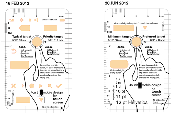
- Nothing that will become dated immediately, when a new OS is released.
- Drawing using this should be directly related to fundamental truths and measurements.
So, I removed all the very specific icons, and have just left in general items. These are items the user interacts with, so need to be of a specific size (or larger) and if sketching might be nice as a baseline, like when you make sure to draw the outer frame to scale.
Then, I was thinking of how a type guide is used to assist in design. Or at least, how I have used it. You measure, sure, but let's say I've decided what line spacing to apply. I pick up my Varityper Line Spacing Guage, and put little ticks at each line. Then draw a line across and now I can write, or draw items, along that grid.
To that end, I've made sure the line spacing guides are symmetrical; if you flip the template over, they are in the same place, so you can draw lines across a space without a straightedge. Just trace the outside, then mark ticks, flip it over, mark ticks and draw lines between the two rows of tickmarks. Guidelines for the design. Then write in words.
Which is the other thing I am trying to add, but am running out of room for: an actual type guide. I only included Helvetica, but that seems okay. The deal is not just that it's easier to find type size by putting type samples over them (vs. using a tiny ruler, which I still have) but that point size of type is not exactly the same as the measured size. This can help identify the size of type when you are inspecting your work, or someone else's.
Thoughts? contact me via email, tweet to @shoobe01, or get ahold of me any other way you can figure out how to.
25 June 2012
I've gotten a number of quite specific comments, and two people actually sent me back InDesign files with new ideas. They raise some good points. I am consolidating some, and putting them both in a new variation:
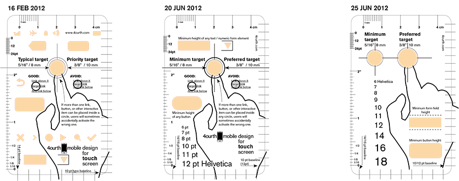
For comparison, since there's still room, the previous two updates are also in there. The new one is to the right.
- First, I suspect it's time to give up on my branding. I liked the logo and phrase but it's big. So, it's gone.
- One thing I am not changing, is the type. Gonna keep using Akzidenz, as I like it. Unless someone has a compelling reason. There are several Helveticas, so... hard to say that's the right alternate, anyway. But I am type-picky. I admit it.
- There were still some errors. Mostly typos.
- I am going to go ahead and use the standard typographers way to refer to sizes and line spacing, type/spacing. Look at the arrows for the baselines and tell me if it's sensible.
- There were 8 mm per cm. Oops. Fixed. Please do proof the hell out of it for me, to make sure there are no stupid errors like this.
- The explanations of the circles and touch interference are getting confusing. So... for now I've dropped them. But tell me how much they need to be there, on the actual template. Will people find these years from now and not know, so need the help?
- There's another circle punched into it. The preferred size is now under the finger, and the concept of overlaying the two circles is gone. The smaller circle is to the side.
- Changed the labels for the circles, so they do not interfere with the baseline and rulers, so aren't confusing I hope.
- Moved the hand a bit, and left the hand outline not overlapping the one baseline rule set. Should I cut it short of the bottom, also?
- Got the whole set of type size in, up to 18 pt. I do worry a bit that just showing numbers isn't the best way to use these... but it fits.
- Changed the way the minimum buttons work. Simplified them, including labels. The form element has little dashes about the minimum padding space, not labeled. Added these in to remind everyone there's also a need to use the minimum touch target circles still.
Now: Provide more feedback. Going the right direction, or not so much?
28 June 2012
General feedback seems to be that this is the right direction. Being more a measuring tool than a drawing tool. So, I think maybe next revision I will even drop the cutouts for all but the touch targets. Does this make anyone sad?
The value of the touch targets as cutouts has even been raised. But I think it's needed. It does attract focus, and makes it pretty clear (from watching people) what you do with it. I also have found it's easier to use the punchouts when inspecting things. This is a key reason I am going with color, vs. transparent, after some experiments. And even why I used a circle template before I made this up. So, I am keeping those holes, at least.
Speaking of watching people use the tool (I put it in front of another 20 or so in Chicago this past week) I have observed some odd behavior. People are sometimes inclined to inspect with all the cutouts. So, when inspecting buttons, they were using the button cutout. Note I didn't tell them it was a button; I guess the shape just looks right. But since it's not really for that... I guess another argument to leave cutouts for the two circles, and no others?
Note that I've dropped the price of the prototypes. Not enough are selling, and I do not want to be stuck with them all. The point was to use them, and get them out in the world to get feedback like I am referring to. Anyone?
And, lastly, I'll be working in San Francisco (during the week only) starting on 9 July. If you want to see one in person, contact me to meet up, or invite me to an event or whatever.
A Digital Design Tool
28 June 2012
There have been a few comments about making a digital version of the tool. I think the coolest way to make that would be a plugin, or some other software that I am 100% incapable of making. But if anyone wants to try, go for it. I'll even help advise and suggest.
But mostly, drawings in Fireworks, Photoshop, Graffle, etc. are in arbitrary scales. Sure, some are in pixels, but at what ratio of pixels to real-world scale? It varies, from one device to the next. So... how to solve that in a consistent manner? There may be a reasonable way, but I suspect it'll be complex, like someone will have to maintain a list of devices, maybe even ordered by popularity, and you pick that to get the scale ratio. Not sure. Discuss.
Kerf distance
Okay, I don't know the right term for this, so bear with me. The kerf is the width of a saw blade. Or more properly, the groove that saw cuts. If you have an 8 foot board, and cut it in half, you can never, ever get two four foot boards. The saw destroys some material while cutting.
Similarly, a pencil is of non-zero size. When you use a stencil to draw, the shapes need to be slightly bigger than the shape to be drawn. Unfortunately, I cannot just look up how much bigger. The stencil maker guys have been not forthcoming with this info. So, I need to determine it myself. First, remind me. Second, if you have good eyes and good measuring tools and use pencil and paper methods, please give your opinion on the extra size I need to make the shapes.
This also is related to the above discussion. Does enlarging spaces slightly mess with using them to measure? I am not sure. Maybe the enlargement is so small it doesn't matter.
25 June 2012
A good point has been brought up, that we can probably assume (or tell everyone) that they should use 0.5 mm mechanical pencils. Then simply make the shapes about 1/2 mm larger. Unless someone else does it for me, I'll play with rules, stencils, magnifiers and high precision measuring devices and find out what the exact size is needed for rough edges and so on. I suspect it'll be 0.6 mm or something.
Sensible enough, or does everyone use 0.7 mm mechanical pencils or something?
I did not update the sizes on the last update to reflect these changes.
A Point is Not a Point
As I have been digging deeper into some stuff, I have discovered that developers following Apples HIGs are using "point" to mean "Device Independent Pixel." It's a specific size, but that size is the size of a non-magnified pixel. A pixel in the original density iPhone or iPad (or iTouch, sure).
On an original iPhone had pixels about 0.006135" across. A PostScript point is about 0.01389" across. So... iOS points are almost half the size of the historical unit of measure called a point. This is not a trivial difference, and is not an even value so is hard to simply account for.
So, the question is: Will calling out type sizes in their conventional unit, the point, be confusing? If so, what else do I call them?
What's On the Sleeves?
I am going to try to get sleeves. I think I found a place that makes Tyvek-like ones for very little. We even get free printing. So, what goes on it? I was thinking, maybe some of the explanatory text that I have removed from the templates to make them easier to read. Or maybe even a bit about typographers points, so they understand each scale. Ideas!
Creative Commons or General Copyright
Like all of my design patterns, I have been thinking of releasing this for re-use and modification. My inclination is to use this license level: Creative Commons Attribution-NonCommercial-ShareAlike 3.0 Unported License.
It's nice to get attribution, but the question is whether it's fair to make it non-commercial. Or, if I can even do that since I am selling these (even if for not much). OTOH, I am freely posting the images, in editable format, so I think it's okay. But I want feedback.
Square Targets?
Here's a question, do we want more lines? One user of a prototype has asked for square targets in addition to the circles. Well, that's not quite right, as the finger targets really are circles. But most UI elements are squared. So, maybe I should add some thin gridlines to the targets? I think I'll do that, unless someone objects to it.
A Better Type Scale
Also to come this weekend, a better type scale. Yeah, it's a bit hard to tell what size you are looking at off a number. But, I couldn;t figure out how to fit a short phrase in there. Well, someone has shared with me that "Akg," as he explains "provide the shortest representation of x-height, ascender and descender levels, as well as any x-height variance between letters with curves and letters without (although at the sizes for mobile this is generally a non-issue). Also at these sizes, any difference between cap-height and ascender height is negligible." So, I am totally doing that.
Production
The first steps towards production have begun. The design is, barring production complications, frozen. The files have been sent to the printers, and they will hopefully get back to me in a few days with any issues, and estimated dates for production to begin.
I also am getting samples for the sleeves, and should then be able to finalize the content to be printed on those. My expectation is that all this is done and in your hands within 60 days.
I will post additional updates when I get dates, proofs, and production samples of course.
Sleeves - Ordered 8 August 2012
This is maybe the final design for the sleeves, so far along it's in the template from the printer. Yes, two colors and some of my branding. It's less than you'd expect. Which is good as I have to buy twice as many as I need. I will probably just give each of you two sleeves, and you can consider that the wear item; when the sleeve wears out, get the spare. 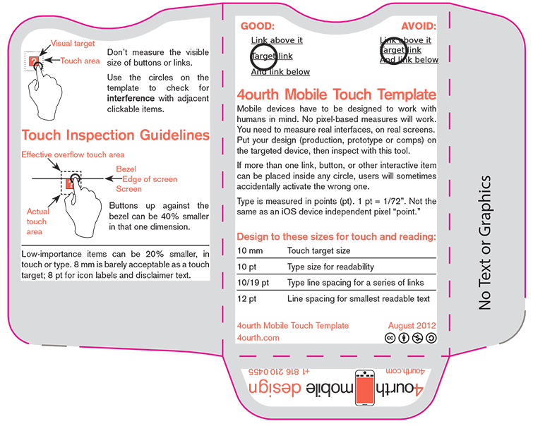
Sleeve then got ordered, and... actually I forget when they will be here. But before the templates.
Templates - Ordered 13 August 2012
I have put down my deposit, and ordered the templates. If you hate the design: too late.
In 8-10 days they will mail me a physical copy which is sorta hand made, but off the real digital cutting files and the real screen for printing. I will, I assure you, take plenty of photos of it and spread the news around. If you want to see it, and are in KC or San Francisco, just tell me and I can arrange that probably.
There may be changes required still. For example, my rulers have really, really small ticks, very close together. I may need to do something like change to every-other point. But, if there are no changes, its supposed to be 4-6 weeks from approval to full production. If we're lucky, maybe I can start mailing or handing these out in late October.
Sleeves - Arrived 18 Aug 2012
Detailed in a blog post here.
Real Prototype Stencil
First, don't be confused. The prototypes I talked above above are laser-cut, and not to final design anyway.
The prototype we're all excited about is from the manufacturer, and cut with real machinery. They send a more or less real one to make sure I like it before dropping thousands of bucks on 500 of these things. It is on the way!
- Your prototype is on the way. The tracking number and delivery date are below. 1zy3w88503952XXXX8 - Scheduled delivery by end of business Wednesday, September 5
I will post photos (maybe even change the masthead image, etc.) when I get it.
5 September 2012, arrived! Junky photo of it here:
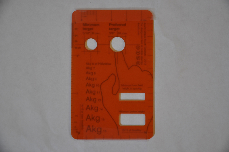
It looks awful because it's a prototype. The printing is not ON the plastic. It's just lined up with a piece of paper with the printing on it. On closer inspection, you guys aren't all helping enough! The label for the 1/2 inch mark is notably low. Enough it needs to be fixed. So, small delay while that gets worked out.
Templates in Production - 3 October 2012
They should have arrived by now, but there was a "production meltdown" at the printing plant. I believe that the stencils are all cut, and are waiting to be printed due to the backlog from this.
The printing plant is running again, so I am told, and ours are queued to be printed in the next couple days. They should be dried, packed and shipped either Friday (5 October) or Monday (8 October). I will begin shipping then.
Other Progress
This is really a placeholder for me to remember to tell anyone who cares about envelopes and mailmerge and shipping progress.
I also may have a small get-together in the Bay Area for those who ordered one here. I am in San Francisco much of the time, and a decent number of folks from here ordered them, so maybe instead of mailing them we can just meet and chat about it. Maybe I can tag along with some other Meetup or other group, also. Do tell if you have an idea.
Production in Hand!
I will be changing this page soon, with new photos. And, I'll probably archive all the versioning and so on, to make it simpler.
Production notes:
- The frosting is a tidge more aggressive than I'd like. You can't see small UI elements through it as well as I wanted. I think because frosting works on contact, but interface elements on a screen are behind glass, a bit further back. Will have to ponder or experiment for a second run if it comes up.
- The thinnest lines are right at the edge of what can be printed. None are breaking up, but weight is visibly variable.
- But, they printed! No bleed, so 1 pt ticks worked!
Update, 18 October 2012
QC issues:
I spot inspected maybe 50 of these on receipt, and during packaging, and noted that the lines are indeed right at the edge of printable weight. Under magnification, some lines are actually not regular, and are on the verge of breaking up.
Well, some of the templates have a few items that indeed failed to print correctly. I know not-nothing about the transfer method (serigraphy) and presume that as the screen became used, but before periodic cleaning, certain items stopped printing. So far, I am only seeing this in the line-spacing measurement ticks in the lower-right corner. The last one can go so far as to entirely disappear, and the adjacent items are also beginning to break up in some cases.
If you note other QC issues, and they bug you, please tell me about it. If the issue makes your use of it troublesome, mention that and I'll see what I think my return/exchange policy is.
Printing is on top:
I apparently never updated the wiki thread with this info. At one point I had explicitly said that I wanted to get the printing on the bottom side, to reduce parallax issues since we're measuring such small devices, and because the screen of the device is embedded in the glass, so is already some distance from the surface you can put the template on.
This didn't happen after conversation with the manufacturers, because they had notable concerns about wear, and because the template substrate is not symmetrical. The bottom is smooth and shiny, and they had never printed on it before. Anything different is risky, and they were not willing to assume the risk even for an experimental run. I don't have enough funding to pay for a possibly failed attempt, so went with the default method, printing on top after all. I hope no one is too saddened by this and apologize for forgetting to mention the change.
