Problem
A Vertical List is called for, but you need to include additional graphical information to assist in the user's understanding of the items within the data set.
Almost every technology that allows for lists can simply and reliably include images adjacent to each text label

Solution
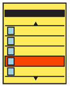
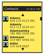
The Thumbnail List is the simplest of concepts. You simply use any type of Vertical List, but in addition to text information, add a small image, or thumbnail, next to each item.
Information displayed, and interactivity with the listed items, is the same as for any other list view. Variations of the Vertical List can be employed as a Thumbnail List.
Variations
While the most common use is where the thumbnail is expected to be the key identifier, and therefore it is the left-most item, any arrangement is possible. Instead of assuming images are most important, try to lead -- either by position, size or contrast -- with the key element the user will index the list. This key element may be text or graphical.
If any one line item has no thumbnail image, it can be loaded without any thumbnail image at all, to place additional emphasis on the data which is relevant and specific to the item.
 Additional list types can be combined with this. The Thumbnail List may also be a Select List and can easily be loaded as an Infinite List.
Interaction Details
The addition of the thumbnail to the list items effects no real changes in the interaction from any other list type.
For lists of information like Address Books, additional options may be presented on screen or within options menus to encourage setting up more contacts with custom avatars. These options should also be presented for individual items, either within the details for the list item (or even when an item is in focus, but not yet selected) or within the detail or edit view for the item in question.
Naturally, you should make the thumbnail itself selectable. This may be as a result of the entire line being selectable, or you may choose to attach a special function to the thumbnail.
Presentation Details
Thumbnails are commonly cropped to a common size and shape, such as square. Sufficient room must be placed around the image to allow it to be differentiated from those on other lines, to be seen around the bezel, and for text adjacent to it to be readable.
Consider use of borders or shadows on thumbnails, so images masked to a color similar to the background, or which are in content similar to the background image or color, can still be detected as thumbnails.
![]() When no specific thumbnail image is available, you may replace it with a a default icon or other image. However, do not repeat these too often. The value of thumbnails is in glanceable identification. Too many placeholders can ruin this function for the real, custom images.
When no specific thumbnail image is available, you may replace it with a a default icon or other image. However, do not repeat these too often. The value of thumbnails is in glanceable identification. Too many placeholders can ruin this function for the real, custom images.
Less attention may be paid to differentiating individual line items, as the thumbnails and their spacing (especially when used as the leading item) will solve this problem.
When the thumbnail performs an actions different from the adjacent text, make sure this is clear. Preferably, make sure it is information carried by the thumbnail itself. For example, a call history log may only list in text the number and date. Selecting those areas would re-load the call details, allowing calling back, while the thumbnail would serve as a link to the Contact list itself.
Antipatterns
Avoid using this pattern when there are not many unique thumbnails. Address books, for example, all seem to be Thumbnail Lists now, but are very often populated mostly or entirely with the default icon. This adds no value.
Even when only a few items have a default icon, carefully consider how to treat this. Images may be eliminated, a large set of default icons used, instead of just one, or some other semi-unique visual identifier could be loaded based on other known attributes.
Do not crop images if the image itself is the key identifier. In a list of people, the thumbnail is an icon, but if an image list is being displayed, aspect ratio and full-frame images (even if thumbnails) may be crucial to identify the correct image.
Pay as much attention to type size, color, spacing and weight as with a Vertical List. Do not assume all text is equally secondary. Some users will rely on text, the image may not be helpful, or text may help differentiate similar images.
If text is truly not helpful, do not use a Thumbnail List. Use another pattern, such as Carousel or Grid to make the selections.
Next: Fisheye List
Discuss & Add
Please do not change content above this like, as it's a perfect match with the printed book. Everything else you want to add goes down here.
Examples
If you want to add examples (and we occasionally do also) add them here.
Make a new section
Just like this. If, for example, you want to argue about the differences between, say, Tidwell's Vertical Stack, and our general concept of the List, then add a section to discuss. If we're successful, we'll get to make a new edition and will take all these discussions into account.
