Problem
Large data sets often hold information with multiple, clearly-defined attributes, shared among many items in the set. You have to provide a way for users to sort and filter by several of these common attributes at once, in order to discover the most relevant result.
Sort & Filter is at it's heart an information processing and organizational pattern. While some variant implementations may have special technical needs, the concept can be implemented on any platform, even a website for the lowest-end, script-free browsers.
Solution
Search can be considered as either information finding or information exploring. Simple tools like Search Within are for finding specific information the user already knows to exist. This is clearly exemplified by that pattern's most common use, the handset address book. The user should know each of these individuals, has generally added each one by hand (though the rise of contact synching makes this less sure each year), and is looking for a specific one by name.
Exploratory search is use to find items the user suspects exist, or which they cannot explicitly recall. Faceted search (searching on different attributes to approach the results from multiple angles, such as the cut facets or faces on a jewel) may be required to find such ill-defined items. Sorting is used to present the most relevant results first, from of a possibly large results list.
The keys to implementing Sort & Filter features on mobile are:
- Progressive disclosure.
- Contextual relevance.
Even when there is room, users may not understand that multiple selections are offered within a single selection area and may be confused or only make a single selection at a time.
Some options -- and especially sorting options -- may not have a clear value to the user before the results are displayed. Instead, offer a single key selection, then when results are displayed then present additional facets for search, or the ability to sort the results.
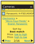
To aid the user in obtaining the best results, always make informed default choices for them. Sorting, for example, should be "best match" for most cases, but may need to be alphabetical for items such as people, due to the familiarity with names.

Variations
The exploration of information that Sort & Filter offers may be presented in one of two distinct manners:
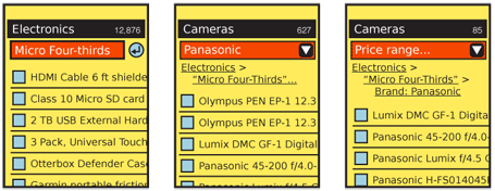
Navigation -- The current filter set should appear as a similar navigational paradigm. The whole displayed set will be applied to the same level, and when the individual selection is made, others will be excluded and cannot be selected again. When no subsidiary facet is available (or when selection of another facet requires an explicit action), these may appear to be a structure like Tabs, and indicate which selection has been made. Else, the selection is effectively a Button, and submits the change. This display method is not suitable for sorting, as it may be perceived as an exclusive set (a filter) and the results may confuse the user.
Submission -- The current set of filters are offered as a series of links, or a set of Form Selections such as a pulldown list. When selected, these will be submitted immediately. Sorting should always use this pattern. When space allows, use a series of Links as a breadcrumb, so the entire set of options is visible to the user.
As long as additional facets are available for selection, the next one in turn will be offered, generally at the top of the results page. Sorting is always offered, but in an area distinct from the filter, and with a clear label.

Interaction Details
As each facet is applied individually, whether of "navigaton" or "submission" style, only the one set of items is offered, and the user must use a separate method to access and change other facets.
This will be presented as a history list, "breadcrumb," or "back" function. Allow the user to step back in the process, or jump to the relevant section. Additional, subsidiary choices should be retained and re-applied, or the previous settings be the default values when subsequently offered within this session.
Though the initial selections should be offered individually, once selected the user may have formed a mental model of the system, so the entire set may sometimes be presented as a series of selectors. The user may change as many as desired and submit these changes as a batch, or individual changes may immediately take effect.
User input should be preserved in general. Especially when some filters have been applied as text entry, some sort of retrieval, undo or history function should be provided. Though it may not seem like user entry, the Cancel Protection, and Exit Guard principles should be applied due to the possibility of the user spending some time creating a detailed, custom search.
Some filters should support multiple selections for a facet, or may already do so in the desktop iteration. An example is to view only certain brands; in this case, only being able to see one at a time may not help. If needed, this may require a large modal dialogue or full-page selector and and a Select List. A similar problem, also requiring a large dialogue or full-page, may be encountered with range selectors.

Presentation Details
Faceted search helps users who need or want to learn about the search space as they execute the search process. Facets educate users about different ways to characterize items in a collection. If users do not need or want this education, they may be frustrated by an interface that makes them do more work.
The search space is classified using accurate, understandable facets that relate to the users’ information needs. As I’ve discussed before, data quality is often the bottleneck in designing search interfaces. Offering users facets that are either unreliable or unrelated to their needs is worse than providing no facets at all.
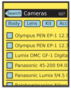
Display results in the most suitable method. Usually, you will find this to be a Vertical List. Sufficient space must be provided for the functionality described. When space provides, and when technically possible, it is desirable to have the Sort & Filter functions be docked to the top of the viewport. In this way, the user may decide additional or different selections are required at any time when browsing the results, without scrolling to the top. If this is not practical, place the selectors at both the top and bottom of the results.
Display methods, such as limited-size lists with Pagination or using an Infinite List are up to the designer and the needs of the user. Consider the entire interaction, though, and assure the user can get to the Sort & Filter functions easily.
The currently-applied filters should be presented in the page Title, or just below it, as space allows.
Antipatterns
Many conventional sorting patterns such as clicking on column headers in table displays, do not work well in small screens. Even when screen space is available, user expectations are not the same, and these generally will not work without explicit instructions.
Sort and filter can be easily confused by users, so should be presented in different areas or at different times. Use clearly differentiable labels such as "Show only" for filter and "Show first" for sorting. The terms "Sort" and "Filter" are largely meaningless to the majority of end users, so should be avoided.
Do not simplify navigation or search systems for mobile due to the constrained interface. If the information is the same, then the user's needs are the same. In many cases, the need for getting specific information quickly is greater, due to the additional difficulty of browsing and reading content from many results.
Selected actions should always be performed on the entire results set. Do not, for example, just sort the items currently displayed on the screen, or which have been downloaded to the device cache.
Next: Widget Wrapup
Discuss & Add
Please do not change content above this line, as it's a perfect match with the printed book. Everything else you want to add goes down here.
Examples
If you want to add examples (and we occasionally do also) add them here.
Make a new section
Just like this. If, for example, you want to argue about the differences between, say, Tidwell's Vertical Stack, and our general concept of the List, then add a section to discuss. If we're successful, we'll get to make a new edition and will take all these discussions into account.
