Problem
You should always label each key element to make context or process completion clear.
Titles are a key part of all OSes, applications, and web standards, but it is always up to you to include them in the design in the appropriate manner.

Solution
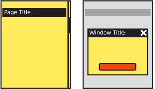
Pages and elements or content sections within a page should almost always be labeled. Pop ups and other freestanding elements should have titles similar to the page-level title. Figure 1-13 shows both of these.
You should make a special point to use Titles in a consistent manner. Consider the size, location, content, and type style. The simplest method for the page level, especially for applications, is a straightforward title bar. We show this in almost all the diagrams in this book.
Variations
Titles are always horizontal, and any top-level title should be boxed, or otherwise separated out to make it clear that it is a key element.
Subsidiary titles are also text, but the text can be stylized as needed (bold, color, etc.) or additionally include boxes, rules, indents, or other graphical treatments to differentiate them from the remaining content, and to more clearly communicate their hierarchy.
If the OS calls for it, you should make the title of the running application display in a spe- cial title style. If so, there is no need to repeat the application name within the page title area. In some cases, the application title bar may disappear shortly after the application is loaded.

Interaction Details
Titles are not required to have any interaction.
A typical interaction for titles of modules or sections is to make the title a link to another page.
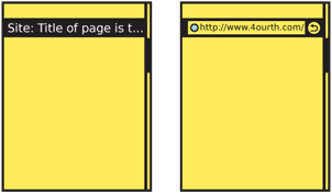
The title bar of a full-viewport page can be used to reveal additional information (tap or drag down to reveal functions such as URL entry for a web browser, as shown in Figure 1-14) or as an anchoring element for very long pages (tap to return to the top of the page). These are generally only useful for touch and pen devices; for scroll-and-select input, having to scroll past the title is generally additional effort to be avoided for secondary functions such as this. If needed, place them within option menus.
Presentation Details
Whenever possible, you should follow OS guidelines for title design. Though naturally this applies to applications, even web design should follow these guidelines when they can be targeted to the OS level. Even if significant changes are required for unique branding of your product, make title bars of similar typeface and style, size, shape, and position to the rest of the OS. For example, if the OS uses white title bars and black text, you can easily use a black bar and yellow type, and it will look consistent enough if the size, style, and position are identical.
 Titles can include icons. Try not to be needlessly repetitive. When available, use a more specific icon instead. For example, in a Pop-Up, don’t repeat the application icon, especially if the window behind it is clearly visible. Either display nothing, or use the space for icons that indicate the state, such as an error triangle if there’s an error.
It is best to get professional writing resources. If this is not possible, obtain a style guide, define a communication style for the product, and stick to it. Use similar language for all descriptive titles.
- Use the same voice and, when practical, tense.
- Use a single name for your product, when it has to be referred to at all.
- Use consistent capitalization (sentence or title case). If parts of the product are con- sidered proper names, make sure everyone has the list of these names.
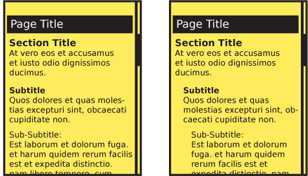
Design the whole product around a simple hierarchy, and stick to it. Avoid going too deep; past about three or four levels usually becomes confusing, and it will be difficult to differentiate titles. Indenting is a common way to help express a hierarchical relationship. You might think that most mobile devices are too small to use this effectively, but don’t worry, only a few pixels of indent can communicate this well. Compare this to the way a Hierarchical List is designed, and how it communicates the relationship between parent and child elements. See the examples in Figure 1-15.
Just like H-level elements in HTML (H1, H2, etc.) similar title and other display hierar- chies are built into native OS development kits. Often, as with semantic web concepts, these have default attributes assigned which can be useful when building the product and can add value to the user experience. Even if additional styles are imposed, you should try to use these basic attributes as the first definition level.
When titles are links, make this clear and follow conventions used in the rest of the ap- plication or site. Additional hints may be needed; even if color normally denotes a link, this may not be clear enough for titles which are often a different color from the content text anyway. Icons or underlines may be needed.
Antipatterns
Avoid jargon, or exposing internal processes. Avoid excessively harsh error messages, and other things which may confuse or annoy typical users. Even for certain special professions and hobbies, your customers will generally not understand your internal processes and organization. You have to explain this to them instead, in their language.
Do not repeat content. If the application is described adequately, do not keep restating the application name in subsidiary page or Pop-Up titles.
During testing, and periodically as maintenance, be sure to check all content. Often, only mockups or the primary path is inspected, but alternative paths and errors must be as clear, consistent, and well described as any other parts of the product.
Next: Revealable Menu
Discuss & Add
Please do not change content above this like, as it's a perfect match with the printed book. Everything else you want to add goes down here.
Examples
A few OSs have absolutely fixed locations for application titles. Except for the few cases where an app is allowed to take over the entire viewport, the title is clearly displayed. Often, as on this N900 (and Symbian devices as well) this exists within the Annunciator Row so it doesn't take any room from the content display area.
![A few OSs have absolutely fixed locations for application titles. Except for the few cases where an app is allowed to take over the entire viewport, the title is clearly displayed. Often, as on this N900 (and Symbian devices as well) this exists within the [[Annunciator Row]] so it doesn't take any room from the content display area. A few OSs have absolutely fixed locations for application titles. Except for the few cases where an app is allowed to take over the entire viewport, the title is clearly displayed. Often, as on this N900 (and Symbian devices as well) this exists within the [[Annunciator Row]] so it doesn't take any room from the content display area.](/wiki/Titles?action=AttachFile&do=get&target=n900-title-ann.png)
Some older OSs had larger dedicated informational areas at the top of the screen, such as this old pen-driven PDA-phone (Touchpoint 3000). Featurephones often still use this same principle, at least for native apps, and leave dedicated navigational and title areas below the annunicator row.
Too many modern OSs, like Android shown here, do not enforce title presence, much less a hierarchy of titles. The left-hand app uses the OS standard title bar, but the right hand one is full-screen for no particular reason and has foregone a title. Some apps also use custom title presentations, or their own status bars. This should be avoided.
Windows Phone (7 and apparently 8) are expressing the hierarchy as part of the whole design of the OS. The app name (for third parties at least) is always visible, and room is provided for large section/subsection titles. They flow off the viewport as a deliberate design motif, but the principles are the same as those outlined above.
{{attachment:windowsphone7.jpg|Windows Phone (7 and apparently 8) are expressing the hierarchy as part of the whole design of the OS. The app name (for third parties at least) is always visible, and room is provided for large section/subsection titles. They flow off the viewport as a deliberate design motif, but the principles are the same
Make a new section
Just like this. If, for example, you want to argue about the differences between, say, Tidwell's Vertical Stack, and our general concept of the List, then add a section to discuss. If we're successful, we'll get to make a new edition and will take all these discussions into account.

