|
Size: 10445
Comment:
|
← Revision 24 as of 2011-07-31 20:36:48 ⇥
Size: 10478
Comment:
|
| Deletions are marked like this. | Additions are marked like this. |
| Line 82: | Line 82: |
| Next: '''[[Peel Away]]''' ---- |
Problem
You must provide access to a small number of items at the same level in the information architecture, while also clearly communicating this hierarchy of information.
Tabs are a very common interactive method, and can be implemented on almost any device or platform. Some will have built-in tab implementations, which may restrict the methods you can most easily choose from, but also help enforce consistency across the OS.

Solution
Tabs are based on real life objects, the tab labels that stick up from file folders. The folders contain information that takes up too much room to just leave on the desk. To make sure they work, follow the same principles as the paper and file cabinet:
- Clearly label what is inside the item associated with each tab.
- Indicate when you have the one you want selected, or open.
- Make sure all tabs and labels are visible at once, or it is clear there are more to be seen if you scroll, or otherwise interact with the tab bar.
Tabs do not actually have to look like file folder tabs, with rounded corners, or even with any container at all. But the principles still apply. For interactive applications, one (and only one) tab is always opened, the contents are visible, and the tab indicates which item is currently open.
Tabs are generally only used for sets of pages or features between three and eight items. When using with only two items, the design may fall apart, and must be carefully designed to make it clear which is selected. Larger sets, especially when they do not all fit on the page, may cause the user to become lost. If very large lists of items within the information architecture must be displayed, consider a more list-like pattern instead, or re-consider if the IA is correctly built.
Tabs can sometimes overlap with Fixed Menus. If you provide access to a number of other screens as part of a menu, and the menu items are visible on more or all pages, you may be confusing the two patterns. Whenever the selection also indicates current position, it is a Tab. Be clear which one you are using.
Variations
Aside from graphic design distinctions, there are basically two axes upon which tabs may vary:
Tabs may be used across the site, application or process, as an indicator and access point to the highest level of navigation available without exiting. Or, they may be used within a single page or page template to provide access between broadly equivalent types of information without logically leaving the page.
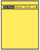
All the available tabs should be visible at all times. However, this is often not possible due to labels being too large for the screen. Tabs which do not fit may fall off the sides of the screen, and those that fit will appear as focus shifts. In the most extreme case, only a single tab will fit the screen, and sideways scrolling is required to see any other tabs.

Interaction Details
For scroll-and-select devices, tabs are most useful when the remaining content only requires vertical scrolling. In this case, pressing the Left or Right scroll keys anywhere on the page will switch focus to the current item in the tab bar, and subsequent presses will switch focus to the next item in line. Pressing OK/Enter will select the tab and switch to that page, section or function.
When using a tab bar to switch out content for a subsection of a page, sideways scrolling among those tabs will become available when vertical scrolling has brought the tab bar into focus. This works very much like it does for sub-scrolling of a textarea in a form. The current item will be in focus, and others may be focused in the usual manner. While in this tab row, any other tab rows may not be accessed.
For scroll-and-select devices, tab rows should always be circular lists. When at the end of the list, another directional press in the end-of-list direction will jump to the front of the list. This is especially important if your tabs do not all fit in the viewport.
For touch and pen devices, always allow the user to directly interact with the tabs. However, this can be a problem as the tabs must be correspondingly larger to allow for the touch target. Again, unless the labels can be small enough or the device is large, tabs may not be the best option. For cases where not all tabs fit on the screen, scrolling (by dragging in the tab bar) may allow browsing of the whole tab row.
You may combine other interactive mechanisms such as Filmstrip with tabs, to allow multiple interactive methods to access the other screens with On-screen Gestures while still making the location in the system clear.
For any selection mechanism, selecting a tab when the tab row does not entirely fit on the screen will cause the current tab to become centered immediately. If this is not technically possible, it will assume the centered position when the new content loads.

Presentation Details
Tabs really only work well when arrayed horizontally, or when all are on one row. Vertical tabs of any sort are rarely are understood by the user to be tabs, so will not be discussed here.
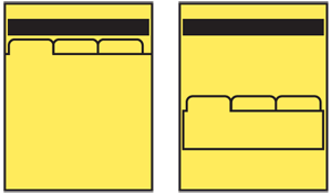
You may save some vertical space, in some cases, by using the highlighted tab as a Title for the page or component. Assure that it is clear, readable and sufficiently prominent to serve both roles.
Tab labels are generally text. Icons may be used to support them, but will rarely be understood sufficiently without text. Use labels in a consistent manner, and assure they are clear and jargon-free. See the Titles pattern for more discussion of labeling. You may sometimes get away with truncating the text, or allowing it to marquee (scroll) when the tab is in focus. This can be helpful to regain space, and make each tab a consistent size, but make sure they are still readable.
Tab rows should be presented as though they are dead end lists, with fixed end points. Only when an overflow action is selected will the user jump to the extreme other tab. Animation may be used for tab rows that do not fit on the screen -- rapidly scrolling back to the other end of the list -- to more clearly communicate the position that has been selected.
When not all tabs fit on the screen, you must provide some indication that there are more tabs. There are three basic methods:
- Fit whatever is possible, so parts of tab containers and labels are on the screen. This is most clear, but can be perceived as "messy" by some interface designers.
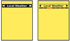
- Only fit complete tab labels on the screen, including as few as one tab. The presence of additional items is only communicated with an indicator (such as an arrow) at the ends of the list with additional items. This can be more difficult to discover so should be designed carefully to assure the indicators are clear and visible.
- Use "magnification" to indicate the position in the complete list in a tab-like manner, while providing a much smaller number of labels at a a readable size.
Any indicators that there are more tabs off the screen must reflect actual content with the dead-end list paradigm. That means when the end of the list is reached, you remove all stubbed tab containers, arrows, and other indicators.
When scrolling through the tab list, make sure any visible but non-selected tabs look different from the selected one, even without comparison, so that users do not mistake it for the page Title.
Antipatterns
When only one or a few tabs are visible, assure the tab paradigm is clear, and it is obvious the tab is not just a page title, but is one option of many to be chosen from.
Clever solutions for space rarely work, so follow best practices and existing working methods before attempting to develop your own solutions. A second row of tabs always is perceived as subsidiary to the top row, and is not read as a second row of text would be.
Avoid using tabs for both high-level and in-page navigation, as two different rows. If needed, differentiate the two in some key way to express the hierarchical difference.
When tabs are used within a page (such as providing a switch between overview, detailed specifications, and reviews), avoid refreshing the entire page. Logically, and by convention that users are familiar with now, this should only load the requested information, and leave the rest in place, without even flickering.
When scroll-and-select is the only selection mechanism, and page interaction uses a virtual cursor, tabs are not suggested as they may be slow and difficult to select.
Do not use conventional circular list presentation, where the last tab is adjacent to the first tab. Users may loose track of their position in the list.
Avoid using Pagination ("1 of 6") or other generalized Location Within widgets to indicate how many tabs are available. These patterns are associated with other access methods, so may disrupt building an accurate mental model of the IA.
Next: Peel Away
Discuss & Add
Please do not change content above this line, as it's a perfect match with the printed book. Everything else you want to add goes down here.
Examples
If you want to add examples (and we occasionally do also) add them here.
Make a new section
Just like this. If, for example, you want to argue about the differences between, say, Tidwell's Vertical Stack, and our general concept of the List, then add a section to discuss. If we're successful, we'll get to make a new edition and will take all these discussions into account.
