|
Size: 5749
Comment:
|
Size: 5833
Comment:
|
| Deletions are marked like this. | Additions are marked like this. |
| Line 1: | Line 1: |
| {{attachment:|Refresh and stop buttons are key to all web browsers. Here, the two buttons are adjacent to each other. The “Reload” button is in use (and should be animated) but is grayed out, and cannot be selected again. The “Stop” function is available for selection. The status bar reinforces the behavior requested, and the animation of the loading button, with additional details.|align="right"}} {{attachment:|Here, the superimposed style has only one button visible at a time. Since the page is loading, the “Stop” button is the available item. To assure this is clear enough, a different status row is used, with the icon seen in the “Reload” function animated here.|align="right"}} {{attachment:|Synch and cancel buttons can appear conditionally, and in different screens. Here, for example, a “Synch Now” function within application settings returns to the main screen, with an animated status icon indicating synch is taking place. Adjacent to it is a cancel button which otherwise is not present.|align="right"}} |
|
| Line 12: | Line 5: |
| {{attachment:ReloadSynchStop-Adjacent.png|Refresh and stop buttons are key to all web browsers. Here, the two buttons are adjacent to each other. The “Reload” button is in use (and should be animated) but is grayed out, and cannot be selected again. The “Stop” function is available for selection. The status bar reinforces the behavior requested, and the animation of the loading button, with additional details.|align="right"}} | |
| Line 26: | Line 20: |
| {{attachment:ReloadSynchStop-Superimposed.png|Here, the superimposed style has only one button visible at a time. Since the page is loading, the “Stop” button is the available item. To assure this is clear enough, a different status row is used, with the icon seen in the “Reload” function animated here.|align="right"}} | |
| Line 34: | Line 29: |
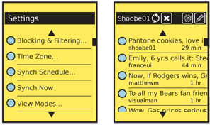
| {{attachment:ReloadSynchStop-Disconnected.png|Synch and cancel buttons can appear conditionally, and in different screens. Here, for example, a “Synch Now” function within application settings returns to the main screen, with an animated status icon indicating synch is taking place. Adjacent to it is a cancel button which otherwise is not present.|align="right"}} |
Problem
User control must be provided for loading and synching operations with remote devices or servers.

Solution
Remote data sources provide the bulk of the functionality of modern mobile devices. Due to specific user needs, accidental inputs or system constraints, the user must sometimes manually start or stop data transfers.
Some examples:
- Loading web pages
- Synching with address books
- Synching with email servers
- Submitting transactions
- Transferring files to local devices
- Sending images over MMS
While as much as possible should be done automatically, user over-ride and user control should always be provided. These will be paired "Reload" and "Stop" buttons, either in the application directly, or in settings.

Variations
There are two very common methods used to provide these functions. The selection of one over the other is largely up to design principles and space considerations; they are otherwise functionally equivalent.
Adjacent - Space is provided for both buttons to be visible at the same time. Generally, only one can be active, and the other is "grayed out." Disabling inactive buttons and indicating this is usually preferable to removing the inactive button entirely, so users become familiar with the controls. Inactive buttons may also convert to status indicators; a "Synch" button can spin to indicate synching, while leaving the "Cancel" button location free to carry out it's function.
Superimposed - Only one space is provided for the two functions. Since they are mutually exclusive, only one function is needed. However, some user may become confused as to the location of the other function, transitional states (e.g. "Stopping") require the user to wait for their completion. Status may not be well communicated by the buttons, as the alternative action must take precedence. When synching, the button will convert to "Cancel" and status must be communicated elsewhere.

Interaction Details
Selecting any button will begin performing the action immediately.
For either version, only allow access to buttons that can take effect in the current state. If a web page has completed loading, do not allow a "Stop" function to work.
Do not accept duplicate inputs. If a "Stop" command has been received, do not accept further "Stop" commands. If the system is poorly built, and might "forget" a previous command, fix the system, instead of requiring the user to carry out a simple, single-point behavior multiple times.
For either case, it is best to assume that the request will take a brief time to take effect, and to account for accidental double-taps, and other mistaken inputs. Do not allow conflicting actions, such as "Stop" immediately followed by "Reload" within about 1/2 second.
Presentation Details
For either version, only allow access to functions that are available in the current state. Suppress or "gray-out" buttons that do not apply. For functions already submitted, a more subtle state change may take effect to imply the button has converted to an indicator. For example, when a "Synch" button has been pressed, the icon should animate to indicate the synch operation is occurring. Remember that many remote operations, even just stopping a request, will take some coordination to take effect; the in-progress state will take a significant amount of time so must be represented.
When a status area is present, such as those described in Notifications, the any current behavior should also be indicated there. This should be true for actions that will result shortly in the process becoming idle. A command to cancel loading should display "Stopping..." or similar.
Labels, whether as a graphic Icon, a text label, or only as a Tooltip must be clear and accurate. Do not use "Reload" for a synch operation, for example.
Antipatterns
Do not presume users will understand that selecting an action again will stop it. For example, an interface may have a "Synch" button. When selected, it animates. The user is then to understand that pressing it in the animated state is functionally "un-synch," but in practice this works poorly. Explicitly label, both graphically and with text, all functions.
Never provide just one button of a pair. Do not provide a "Synch" button if you don't also provide a "Cancel" button.
Don't ever display a status about load or synch behavior -- especially not as a modal popup -- without a way for the user to cancel the operation. If canceling is technically impossible, clearly explain this, and indicate why.
