|
Size: 8690
Comment:
|
Size: 8687
Comment:
|
| Deletions are marked like this. | Additions are marked like this. |
| Line 4: | Line 4: |
| The '''Page''' is the area that you will spend your time designing for any application or website. A part of it is visble in the viewport of the mobile screen during its current state. And there are states and modes and versions to be considered, as well as addressing what is fixed to the page, what can float, and what is locked to the viewport. | The '''Page''' is the area that you will spend your time designing for any application or website. A part of it is visible in the viewport of the mobile screen during its current state. And there are states and modes and versions to be considered, as well as addressing what is fixed to the page, what can float, and what is locked to the viewport. |
| Line 64: | Line 64: |
The Page is the area that you will spend your time designing for any application or website. A part of it is visible in the viewport of the mobile screen during its current state. And there are states and modes and versions to be considered, as well as addressing what is fixed to the page, what can float, and what is locked to the viewport.
Based on cultural norms of reading conventions and how people process information, you have to design elements for the page, and and lay items out on it in ways your users will understand. You also want to create information that is easily accessed, and easy to locate. Your users are not stationary, or focused entirely on the screen. They’re everywhere and they want information quickly and easy to manipulate.
Unlike later sections, which cover broader topics, the Page patterns that will be discussed here are contained in only a single chapter:
Chapter 2, Composition
Helpful Knowledge for this Section
Before you dive right into the patterns, we will be providing you some extra knowledge in the section introductions. This extra knowledge is in multi-disciplinary areas of human factors, engineering, psychology, art, or whatever else we feel relevant.
For this particular section, we will provide background knowledge for you in the following areas:
- Digital Display Page Layout Guidelines.
- Page Layout Guidelines for Mobile Users.
We have also included suggested further readings at the end of the Page Wrap Up section. These include reading the Introduction to Mobile Typography section found in the appendix which details characteristics of typography as well as mobile readability and legibility guidelines.
Digital Display Page Layout Principles

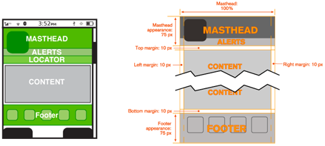
Composition of a page is about the assembly of components, concepts, content and other elements to build up the final design. As we already know, consistency is important, so these are not placed arbitrarily on the page, or even just as the one page dictates, but on rules across the system, or even the whole OS.
At the highest level is the "grid." This is a regularized series of guides, defining the spacing and alignment of the main elements on the page. Some rules are inviolable, such as margins and some are specifically designed to offer options for special page layouts, or unexpected future changes.
From these are developed a series of templates, from which each page in the application, site or other process will be designed and built. This all encourages a consistent user and brand experience that supports content organization and layout, advertising requirements, navigation, and message display characteristics such as legibility and readability.
Patterns within the Composition chapter like Fixed Menu and Revealable Menu, Notifications, and Titles are repeated at the same place on each and every page, so reside in each template. A subsidiary concept is that of the "wrapper," which defines these common components -- and others, such as scrollbars -- so they are consistently designed and built for each and every page template.
Mobile users have specific tasks and goals. They require the information to be quickly located and effectively organized. Therefore, the page layouts need to reflect the mental models and schemas understood by the users. If these are ignored, users will become frustrated, unsatisfied with their experience, create miscues and errors, and might even give up!
Furthermore, using page layouts wisely, allows you to organize and place content effectively on valuable screen real estate where every pixel is important.
Page Layout Guidelines for Mobile Users

- Mobile screen real estate is valuable. Avoid uses of banners, bars, images, and graphics that take up space without any specific use. This use may be secondary, such as communicating the hierarchy or structure, but the designer should always be able to describe the reason.
Lay out elements within a design hierarchy. There are optional versions, and some interactive types insist time is another component, but for simplicity it's: Position > Size > Shape > Contrast > Color > Form. The most important items are larger, higher, brighter, and so on.
- Consider the Gestalt laws of Closure, Continuity, Figure and Ground, Proximity, Relative Size, Similarity, and Symmetry. These are discussed further in Part II, Components.
- Use consistent and simple navigation elements. People have limits to the amount of information they can store in their short term memory. Therefore, they automatically filter information that is important and stands out. Information elements that are excessively displayed and irrelevant will be ignored and overlooked.
- Wayfinding is really rooted in real-world navigation, like getting around town, or finding the right room in a building. Kevin Lynch, an environmental psychologist, established five wayfinding elements that people use to identify their position: Paths, Edges, Nodes, Landmarks, and Districts. These same environmental elements are also referenced when navigating digital content on websites or mobile devices. Page numbers, titles, headers and footers, tabs, links and more provide a lot of help that we've inherited almost as a whole for interactive design.
- Consider how users will view your page when plotting content. Generally, users will look for high-priority information in the upper left of the content area (Nielsen: 2010).
- Multi-column text is not to meet some design style, but to restrict line length. And line lengths are not based on fixed sizes, or even percentages of page width, but on character count. Long lines are harder to read. Anything over about 60-65 characters (averaged) is the maximum length you want to use. Too short depends on how many long words you have.
- Titles describe pages, elements within a page, and content sections. Use them consistently and appropriately.
- Default text alignment is left. For right-to-left UI languages, the default text alignment is on the right.
- Try to use bulleted information instead of a table.
- The term false bottom, or false top, is interactive design specific, and refers to users thinking they are at the end of the content and not continuing to scroll. If text flows from one column to the next, or one page to the next, it must be designed so the relationship between them is clear. "Continued on page 86" is all but a hyperlink from the past, which has been inherited by interactive; "read the rest of this blog post" is basically the same thing.
- Interactive systems have an additional challenge in that the page might be larger than the screen (or viewport as we often call it).
Getting Started
You now have a general understanding that a page is an area that occupies the viewport of a mobile display. Pages can use a wrapper template to organize information consistently across the OS that will allow for satisfying user experience. When making design decisions, everything in this page section must be considered, even if you don't have control (not building an OS). You must know what it might do to your design. Consider your user’s goals and cognitive abilities, page layout guidelines, and the importance of legibility and readability in message displays.
The following Composition chapter in this part will provide specific information on theory, tactics, and illustrate examples of appropriate design patterns. And always remember to read the anti-patterns, to make sure you don't misuse or over-use a pattern.
