

Problem
Devices must allow for orientation changes to display content in the manner most readable and comfortable to the user.
Solution
Mobile devices are small, portable and can therefore be manipulated and viewed in any manner. Naturally, users will rapidly face the screen the correct direction, but after this should be allowed to choose their preferred viewing Orientation. Content must be presented in a useful format in whichever orientation is chosen, modified to fit the screen, but without changing context, or modifying existing user entry.
This change must be performed either automatically, or with an obvious or deeply-integrated physical mode switch.
A related function is for devices with screens on both sides, or other form factors; flipping and so forth can follow this pattern, but is not discussed explicitly due to the small number of such devices.
This pattern exclusively addresses screen orientation or activation, and does not discuss use of the orientation sensors as a gestural control. For generalized discussion of position and orientation, see the Kinesthetic Gestures pattern. For some methods of employing more subtle orientation changes, see the pattern on Simulated 3D Effects.
Variations
Variations in Orientation generally follow the device form factor, and consider the effectiveness of the overall device, including input methods.
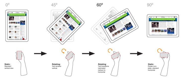
Fixed form-factors, and especially "all touch" devices generally should use automatic sensing to switch from portrait (vertical) to landscape (horizontal) modes. Sensors have generally been accelerometers, to sense the device orientation relative to the ground. The device camera may also be used to sense the user's head position and adjust relative to this plane. Level sensors can sometimes give poor results (when content is being shared or in unusual positions such as laying down); the machine vision solution attempts to overcome this.
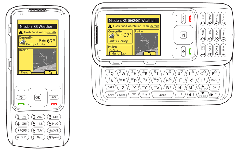
Devices with any sort of variable form factor generally also change the use of the display devices. This physical mode switch serves as a switch to the screen as well. This can be considered to include the activation of an external screen when a clamshell or flip phone is closed. Typical cases for rotation are the now-common messaging-oriented phones, with Directional Entry keys (or sometimes even a numeric pad) when closed, but a fold- or slide-out keyboard. The switch in screen orientation corresponds to the orientation of the hardware entry method.
Interaction Details
For automatic sensing devices, much leeway must be granted before a rotation is committed to. Users will not hold devices perfectly upright, and may use them in unusual orientations.
The angle of commitment must be a large value, such as 60° from the vertical. Rotating to the opposite orientation (180°, such as from one landscape orientation to the other), should likewise not take place as soon as the device passes level, but only after exceeding about 20° of opposite angle.
Once a switch has occurred, use a new baseline to measure from. The angle (60° for example) is measured from the current ideal vertical. The angle at which the orientation switches back must not be the same one for both, or it will flip back and forth repeatedly. This is a key reason 45° cannot be used as the switching angle.
Additional leeway may be provided based on context. Consider a device laid on a table. When picked up, it may be accidentally over-rotated, away from the user. The device should probably not immediately rotate 180° on the expectation that someone else has picked it up.
Here, the sensors can determine the device has been set down, and not used for some time, and reset the baseline to be "from the tabletop." Then, something like the 60° guideline can be used. Only when rotated backwards that far will the screen rotate 180° to be usable at the opposite viewing angle.
The user's displayed on-screen context must in no way be changed. Items in focus must remain so through the change, with selections to the character or pixel when applicable.
No uncommanded actions must take place. Do not clear entry, submit forms, scroll or perform any actions which would not have been performed had the orientation change not taken place.
Presentation Details
Rotation should always be animated whenever possible. Actually show the starting orientation rapidly rotating to the new position. It does not have to animate the entire change, reflowing to the new shape, but the initial animation helps explain the change and confirm to the user that the rotation action is occurring, and not some other, possibly uncommanded, behavior.
Avoid blanking the screen, as this can be perceived as an error or bug, and the discontinuity requires the user to re-setting on the screen.
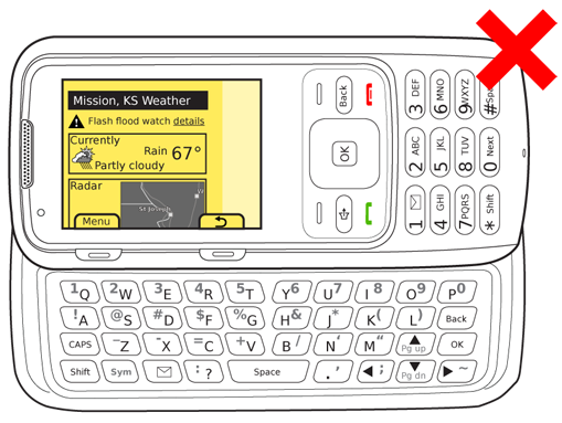
Content should always be re-fitted to the screen. Never allow items to flow off the screen or for gaps or margins to appear to the side as a way to cheat the rotation.
This will necessitate reflowing of text (changing where line breaks occur), or even switching to an entirely different display template, such as placing modules side by side, instead of stacked in a list. However, every effort must be made to have all content from
When this is not possible, the focus area from the initial orientation must always remain in the viewport in the new orientation. For example, if a list view is shown in portrait, and the bottom item on the screen is in focus, when rotated it may be off the screen. Instead, the page must scroll so that item remains in the viewport in the horizontal screen, even though it means other items have been scrolled up off the screen.
At no point should the in-focus item be off the viewport, so use caution when designing an animation to depict this. For example, do not rotate then scroll down to the in-focus item. The time when the in-focus item is out of view may be disorienting.
Antipatterns
Always redraw items on the screen to take advantage of the new orientation. Never leave blank space, allow content to fall off the screen or otherwise take shortcuts that use the new orientation in a less than optimal manner.
A manual over-ride is often provided for devices using automatic sensing. This may take the form of a manual selector or a lock (to prevent rotation from the current position). These are generally arbitrary buttons or on-screen actions, so must be learned. In general, they should be considered a half-measure, and everything should be done to make automatic sensors and their algorithms as good as possible.
Use caution when including both, physical mode switches and automatic sensing in a single device. Consider a perfectly usable "all touch" device, with automatic sensing for orientation changes. When the hidden hardware keyboard is slid out, it makes no sense to rotate as the keyboard would face the wrong way, but the user may have become accustomed to having the ability to rotate orientation.
