|
Size: 5373
Comment:
|
Size: 5613
Comment:
|
| Deletions are marked like this. | Additions are marked like this. |
| Line 28: | Line 28: |
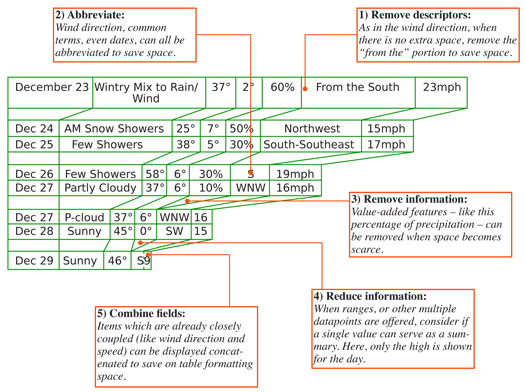
{{attachment:OrderedData-TWC.png|A table showing how tabular data (for The Weather Channel mobile web) can be compressed or expanded as space allows. This shows many methods of displaying several types of ordered data.|align="right"}} |
Problem
Present text and numerical data in the most appropriate format for the context and viewer.
Solution
Content types that are displayed regularly have become regularized in their display, and must be presented in specific formats to be easily recognizable to users.
The types of data being discussed are, for example:
- Names (First name first or last? Middle name, initial, or neither?)
- Times (12 or 24 hours? Are seconds needed?)
- Dates (Order of items may vary, abbreviations are rampant. In some cases, preceding zeroes may be relevant.)
- Days of the week (Languages, as well as abbreviations all the way to single letters in some cases.)
- Locations (City, State then ZIP. But is the state abbreviated conventionally, 2-letters or spelled out. And this is US only.)
- Units of measure (°F, or °Farenheit, Miles or mi., Kilometers or km, and so on.)
As well as many others. Some of these may be specific to a population, and be technical terms or jargon only understood by the user community.
Variations
Two key challenges in presenting ordered data are true for all systems, not just mobiles:
User expectations
In many cases, this can go all the way to universally accepted standards for notation. Units of measure, for example, have standards for long and abbreviated display which should always be followed. Many others have cultural norms instead. Dates are displayed in several formats, most commonly flipping month and date.
If your product will be employed by users from different backgrounds, try to use unambiguous display methods whenever possible. For dates, for example, avoid abbreviating months as numerals. 4/11 can be April 11th or November 4th. The only slightly longer "Apr 11" is entirely clear.
Available space
For columnar display in any interface, but especially challenging on many mobile devices, ordered data types like dates may have design pressure to be compressed to the point they can become unreadable. Do not just rely on common sense, but refer to universally understood display standards to assure the compressed format will be readable. Also consider use of variable formatting based on the available size; if a larger device is used, or the screen is rotated, display larger amounts of information.

Interaction Details
This is a presentation pattern, and generally supports no interaction at all.
It is possible to add additional details to ordered data that may be confusing. For example, if a date is very shortened, then a tooltip or some interactive method may present further details. For example, a date-time code of "Yesterday" can present a tooltip that says "19 March 2011 at 11:21 am."
Presentation Details
There are far too many of these formats to discuss in detail. Some examples have been provided above. Instead, this space will be used to discuss another method of displaying some content types, relative display. This is most useful for dates and times, but as these are very commonly encountered by many types of systems, are worth detailing.
Relative dates and times use the conventional format users would when in conversation. No one says "I called him at 2:17 pm," when they can say "I called him about five minutes ago." Communicating in natural manners like this reduced cognitive load, making interfaces more usable and speedier.
Timings can change depending on the context, but one example of how to do this is:
- Within the current hour, show as minutes ago. Over 20 minutes, round to the nearest five minutes.
- Within the current day, or within 8 hours, show the time as number of hours ago.
- Within the last two days, shown the day of the week, and the time range, morning, afternoon, evening, night.
- Within the past week, show the day of the week.
- Older than this, but within 12 months, show as Mmm/DD.
- Older than 12 months, show as the year alone.
Examples:
- 20 minutes ago
- 8 hours ago
- Tues. morning
- Tuesday
- Nov 20
- 2008
Antipatterns
Do not rely on user settings to solve cultural norm issues. The vast majority of users will not perform such setup. Even if forced, as part of a first-run process, defaults will be used to speed it up. Customization may be allowed, but assure that default conditions are clear and unambiguous.
Do not make up abbreviations. If one does not come to mind, it doesn't mean that it doesn't exist, just that you don't know what it is. Use reference works to find the correct abbreviation. Always find good references, preferably by the governing body, and do not trust hearsay. Street labels in the US, for example, are being rewritten somewhat randomly by local departments and the abbreviation for Lane is now often LA, instead of LN. This sort of change can be confusing.
Do not use default label values without understanding if they have meaning. For another road example, many digital mapping services use "Street" as the default type of roadway. However, in many cities saying "Street" means it run the opposite way as an "Avenue." This carries as much meaning as assuming unspecified times are "AM."
Don't go overboard with interactive display methods. Avoid interfering with the primary interaction of the display, such as selection of a line item.
