Problem
You must provide a method to notify the user of any notifications, of any priority, without unduly interfering with existing processes.
Notification features are generally provided by the OS, but can sometimes be over-ridden. If building a notification-sending application, it must correctly interact with the system. Certain applications and sites can also call for their own notification processes, that have nothing to do with the OS notification system.

Solution
A single, consistent notification method should be provided across the entire OS. Make sure this method does not interfere with any current processes the user is currently involved in. The notification must be able to be acted upon, or dismissed very easily.
When notifications are restricted to a specific subset of a device, such as an application, make sure they follow the same principles and do not conflict with the OS-wide notifications.
Multiple notifications must be able to all be displayed in a single view, so no notification obscures another.
Variations
Multiple variations of this pattern are available.
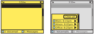
A dedicated notification strip or area may be used, with a portion of the viewport dedicated to notifications. This may be hidden when no notifications are present, but will fade in, slide up or otherwise appear when notifications are present. Selection of any notification item will display it in the application that hosted the notification. This may be difficult to use for scroll-and-select devices, so will be most encountered on touch and pen input devices.
 Notifications may be combined with the Annunicator Row. This is in fact very common on basic and legacy devices, where the envelope icon means new voicemail or SMS messages have arrived. Additional notifications may be added to this area as well. These legacy utilizations are not Notifications as far as this pattern is concerned, as they are not generally interactive; the user must take separate action to dial into the voicemail system or open the text messaging application.
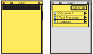
Especially for touch and pen devices, the Annunicator Row may include a notification area. You may place as many notification icons in the Annunicator Row as will fit. When opened, a complete list of all the current notifications will be revealed.
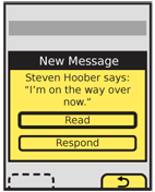
For scroll-and-select devices, and certain other cases (if there is no good place to put a notification area, or the Annunciator Row is unsuitable for repurposing), a simple Pop-Up dialogue box may appear over the current context whenever a notification appears. This is a special case of the Confirmation dialogue, which should be seen for behaviors and layout.
Currently, regardless of the other notification paradigms, incoming voice calls use a completely unique notification method, and automatically launch the phone application full screen. This is a holdover, and may not be a permanent condition. Some OSs already seem to be addressing this by placing a "current call" icon in the notification area when in another application. Selecting the Notifications area allows the user to see certain details on the call, and switch to it rapidly. Using any of the notification methods above could provide as suitable a method of informing the user of the incoming call, and of accepting or declining it.

Interaction Details
A key attribute of the Notifications pattern, as distinct from the Annunicator Row pattern, is the ability to directly interact with the alert. Each item must be able to be seen individually within the notification method, and selected for viewing (or other suitable actions), or be able to be dismissed.
When more than one current notification is available, the method must support showing all of them at once. If the Confirmation dialogue style is used, for example, a special version must be made where a list of all the notifications is displayed instead, and selecting one will open a new dialogue with the details and actions of that item alone. Within this list, batch operations, such as dismissing all notifications, should also be available.
When the Annunicator Row is used to access notifications, tapping or dragging the row will reveal the list of notifications. You should choose a method for the reveal gesture that is be based on other gestures used in the OS, so it is discoverable and understandable when described and demonstrated.
Various actions must be available for any notification item, or for a single notification Pop-Up. See the Confirmation pattern for details on the dialogue especially. Consider which actions might be helpful in reducing the number of steps the user must take. For example, instead of just "Read" and "Dismiss" buttons for a new SMS, a "Reply" button could be added, if the message summary is enough to elicit a response. This will allow the user to act immediately. Use caution not to add too many options, cluttering the selections and reducing the size of displayed information and options.
When a notification is acted up (e.g. the new text message is read) suspend any current operations or actions and save all user-entered data. When the action, application or process initiated by acting on the notification is completed, return to this previous condition.
Presentation Details
Fixed notification areas are most commonly strips along the bottom of the viewport, to differentiate from the Title and Annunicator Row elements. The area should be at a fixed location within the viewport, and not scroll. Scrollbars will not overlap the area when it is displayed. Individual notifications will be displayed as line items, or may be grouped by category, with counters indicating the number of notifications for each category.
Smaller devices, like most mobile handsets cannot dedicate this space, so most often collapse the notification area to an icon or other small area within the Annunicator Row.
Labels for each notification item must be clear and comprehensible. Always state the service or application initiating the notification; usually, an icon will be sufficient for this. If a summary of the message cannot be displayed (such as for voicemail, or an MMS with no text) do not display jargon or difficult-to-parse information such as the sender phone number; use clear descriptions instead, like "New voicemail." Whenever possible, display relevant information; look up senders of SMS/MMS in the address book and when found, display their name instead of the phone number.
If summary information can be provided, such as the content of a text message, this may also be displayed. This is a rare case where "marquee" text, which scrolls within the available space, may be used to good effect. Text messages are short enough that such text display tends to be readable, and to allow the entire message to be read rapidly, without opening the messaging application.
Additional information may also be derived from the notifying application, or other handset services. For the case of a new SMS, any avatar icon for the user may also be displayed, to assist in understanding what is being sent at a glance.
To keep the list of notifications from becoming too long, you should usually clustered them. Instead of a single line for each notification, display one line for all SMS, one for all email and so on. Each line then has a counter of the number of items within it. The OS may limit the behavior you can implement with this. For example, you may not be able to reveal individual notifications, and have to load the application sending the alert.
For most notification typess, you should also blink the LED and sound Tones and Haptic Output (vibration). These must be customizable so the user can determine which types are critical enough, and must follow the system-wide output settings to respect silencing. See the relevant patterns for additional details.
Antipatterns
Do not display notifications serially. If more than one is received at a time, use a multiple notifications method, instead of showing one single notification after another.
Do not allow notifications to prevent access to other systems, even temporarily. The notification system must allow individual notifications as well as all current notifications to be dismissed.
Most media centric activities, such as video playback, should not be interrupted by notifications. Very high priority notifications may still interrupt, but must either pause playback or be very non-disruptive so playback can continue during it.
And never display notifications to external display devices, such as TVs or projectors attached to the device.
Be sure you understand and follow the OS's method of notification and "marked as read." Dismissing a message from view in the notification area may or may not mark it as read in the application sending the notification. There is, as yet, no consistency in this regard, so no pattern can be determined as yet.
Next: Titles
Discuss & Add
Please do not change content above this like, as it's a perfect match with the printed book. Everything else you want to add goes down here.
Examples
Notifications should be on the lock screen, and not require completely unlocking to reveal them, as in iOS 5. Multiple notifications must be able to be seen at once.

Android uses very simple flags, one per application. The bright red item here indicates several SMS notifications are waiting. A count is also included.

Pulling down the Android Notifications strip (yeah, it's also the Annunicator Row, but you can't interact with those parts) reveals the various notifications in summary. Note that even ongoing phone calls get a notification and can be seen in the list.
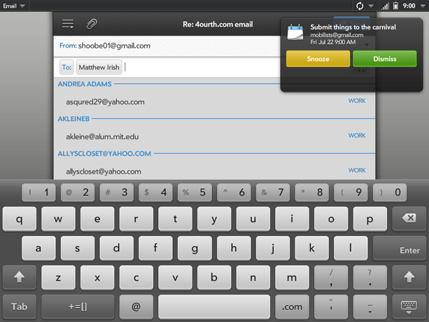
Avoid popping notifications in front of other applications, as with this early version of WebOS on the TouchPad. They improved it later.

Make a new section
Just like this. If, for example, you want to argue about the differences between, say, Tidwell's Vertical Stack, and our general concept of the List, then add a section to discuss. If we're successful, we'll get to make a new edition and will take all these discussions into account.

