Problem
You must provide a function to allow access to related content, from arbitrary locations within a page.
The Link is a very common action element, available in one way or another on every platform.

Solution
Links are simple, textual interactive elements which provide access to additional information, generally by:
- Loading a new page of content.
- Jumping to the portion of the current page which carries the additional content.
Loading a Pop-Up dialogue with the relevant content.
Revealing an adjacent page using the Film Strip pattern.
Links are almost purely hypermedia elements. While not invented by the Web, and not exclusive to it, the ubiquity of websites and links can serve as a good guideline for display standards and use of the pattern; your users can have a single understanding of the OS, applications and the web if consistent methods are used.
Links are generally found in content-rich areas, when used in application or OS contexts. Links to additional information within explanatory text, or for cross-referencing within help systems, are common uses outside of the web. Most other text found within an application or OS will be labels for lists, Icons, Buttons, and so forth.
Links alone are rarely suitable for these situations, so there are numerous interactive methods in this chapter you can choose from for the specific needs.

Variations
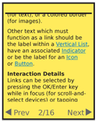
There are no true variations of the link. Links may be found anywhere on the page, and are differentiated from non-linked content, with a change in color and underline (for text), or a colored border (for images).
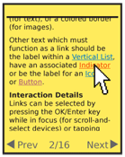
Other text which must function as a link should be the label within a Vertical List, have an associated Indicator or be the label for an Icon or Button.
Interaction Details
Links can be selected by pressing the OK/Enter key while in focus (for scroll-and-select devices) or tapping directly on the link text for pen and touch devices.
Be sure to support focus states, or hover, by changing the link color, and possibly other text styles. These will, of course, only work for devices which support hover, or focus-without-selection. Pen and touch devices generally do not have this capability.

Presentation Details
Inline links should always be a different color from any styled text. Whenever possible, they should also be underlined, but be sure to follow the OS standards. Simply using color can be confused with style and not perceived as a link. If needed, dotted or dashed underlines, or slightly desaturated color can be used to reduce the visual prominence of the underline.
Some systems will use highlighting (a field of color behind the whole link text) instead of an underline. This is easily seen, and should be followed if the OS standard, but some users may not immediately understand the meaning.
Underlines should never obscure descenders. Underlines must break, or otherwise integrate cleanly and clearly. If not, pick another typeface.
For most inline-styled links, the color of the link should reflect the current condition:
- Non-visited
- Visited
- Hover (when available)
- Active (pointer down)
In certain cases, the visited state is of no significance. If the information is entirely dynamic, or the entire experience is used so all links would be "visited" on a typical viewing, that state may be disregarded.
Links in lists use their position in a list, as a series of repeated items, to indicate they are selectable. To avoid excessive horizontal rules (the separators for the individual line items) you usually should not underline links in lists.
The title for each link should be unique, clearly communicate the information on the target, and be easily scannable.
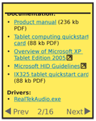
Additional information, in text or as a graphic, should be included after the link to communicate when an atypical target is presented. When a link leaves a site, loads a new application, or will initiate a file download, indicate this. Since normal links do not have icons, any reasonable icon after a link will usually be interpreted correctly. Text following the link should display the file size of downloadable items, and the type of file, such as: (384 kb PDF).
Linked images should be bordered with the same colors as text links, when no other communication is available. When possible, add a description of what will happen to the image, or add a descriptive text link immediately adjacent to the image. Avoid use of simulated text or Buttons in the image; the lack of interactivity (such as hover or active states) may confuse users.

Antipatterns
Do not use links to activate functions. Even within a web page, use buttons and other form elements for action behaviors.
Avoid using generalized terms like "Click here." They are not meaningful, and make the content hard to scan for the relevant information. Especially in lists, try to use unique but descriptive terms. Instead of "Click to view the manual," simply say "View the manual."
Do not use underlines for any other elements on the page, such as for emphasis. User-defined styles may still be allowed when editing text in word processing programs, of course.
The Link pattern defines behaviors for the linked text only. Do not change the background for an entire row or other container in which a link occurs or this will become another type of pattern.
Avoid changing the type style for link condition changes, such as hover. Switching to bold, except for a small number of typefaces, will make the text wider, causing strange jumps, confusing the user and perhaps causing the page to reflow. Other changes may be suitable and appropriate, such as switching from a dotted underline to a solid.
Next: Button
Discuss & Add
Please do not change content above this line, as it's a perfect match with the printed book. Everything else you want to add goes down here.
Examples
If you want to add examples (and we occasionally do also) add them here.
Make a new section
Just like this. If, for example, you want to argue about the differences between, say, Tidwell's Vertical Stack, and our general concept of the List, then add a section to discuss. If we're successful, we'll get to make a new edition and will take all these discussions into account.
