The varying ways people prefer to interact with their devices is highly dependent upon their natural tendencies, comfort levels, and the context of use. As designers and developers, we need to understand these influences and offer user interfaces that appeal to these needs.
User preferences may range from inputting data using physical keys, natural handwriting, or other gestural behaviors. Some users may prefer to receive information with an eyes-off screen approach relying on haptics or audible notifications.
This section Input & Output section will discuss in detail the different mobile methods and controls users can interact with to access and receive information.
The types of input and output that will be discussed here are subdivided into the following chapters:
Chapter 10, Text & Character Input
Chapter 11, General Interactive Controls
Chapter 12, Input & Selection
Chapter 13, Audio & Vibration
Chapter 14, Screens, Lights & Sensors
Types of Input & Output
Text & Character Input
Whether the reason is sending an email, SMS, searching, or filling out forms, users require ways to input both text and characters. Such methods may be through keyboards and keypads, as well as pen control. Regardless, these methods must work very efficiently in performance while limiting input errors. This chapter will explain research based frameworks, tactical examples, and descriptive mobile patterns to use for text and character input.
This chapter will discuss the following patterns:
General Interactive Controls
Functions on the device, and in the interface, are controlled by a series of controls. They may be keys arrayed around the periphery of the device, or be controlled by gestural behaviors. Users must be able to find, understand, and easily learn these control types. This chapter will explain research based frameworks, tactical examples, and descriptive mobile patterns to use for general interactive controls.
This chapter will discuss the following patterns:
Input & Selection
Users require methods to enter and remove text and other character-based information without restriction. Many times our users are filling out forms or selecting information from lists. At any time, they may also need to make quick, easy changes to remove contents from these fields or entire forms. This chapter will explain research based frameworks, tactical examples, and descriptive mobile patterns to use for input and selection.
This chapter will discuss the following patterns:
Audio & Vibration
Our mobile devices are not always in plain sight. They may across the room, or placed deep in our pockets. When important notifications occur, users need to be alerted. Using audio and vibration as notifiers and forms of feedback can be very effective. This chapter will explain research based frameworks, tactical examples, and descriptive mobile patterns to use for audio and vibration.
This chapter will discuss the following patterns:
Screens, Lights & Sensors
Mobile devices today are equipped with a range of technologies meant to improve our interactive experiences. These devices may be equipped with advanced display technology to improve viewability while offering better battery life, and incorporate location base services integrated within other OS applications. This chapter will explain research based frameworks, tactical examples, and descriptive mobile patterns to use for screens, lights, and sensors.
This chapter will discuss the following patterns:
Helpful knowledge for this section
Before you dive right into each pattern chapter, we like to provide you some extra knowledge in the section introductions. This extra knowledge is in multi-disciplinary areas of human factors, engineering, psychology, art, or whatever else we feel relevant.
This section will provide background knowledge for you in the following areas:
- General Interactive Touch Guidelines.
- Understanding Brightness, Luminance, and Contrast.
- How our audition works.
General Touch Interaction Guidelines
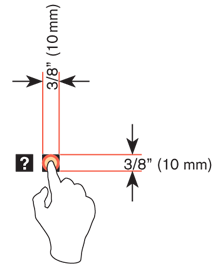
The minimum area for touch activation, to address the general population, is a square 3/8” on each side (10 mm). When possible, use larger target areas. Important targets should be larger than others.
There is no distinct preference for vertical or horizontal finger touch areas. All touch can be assumed to be a circle, though the actual input item may be shaped as needed to fit the space, or express a preconceived notion (e.g. button).

Targets
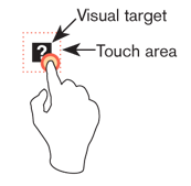
The visual target is not always the same as the touch area. However the touch area may never be smaller than the visual target. When practical (i.e. there is no adjacent interctive item) the touch area should be notably larger than the visual target.
See the example to the right; the orange dotted line is the touch area. It is notably larger than the visual target, so a missed touch (as shown) still functions as expected.

Touch area and the centroid of contact
The point activated by a touch (on capacitive touch devices) is the centroid of the touched area; that area where the user’s finger is flat against the screen.
The centroid is the center of area whose coordinates are the average (arithmetic mean) of the co-ordinates of all the points of the shape. This may be sensed directly (the highest change in local capacitance for projected-capacitive screens) or calculated (center of the obscured area for beam-sensors). A larger area will typically be perceived to be touched by the user, due to parallax (advanced users may become aware of the centroid phenomenon, and expect this).

Bezels, edges and size cheats
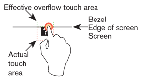
Buttons on the edges of screens with flat bezels may take advantage of this to use smaller target sizes. The user may place their finger so that part of the touch is on the bezel (off the sensing area of the screen). This will effectively reduce the size of their finger, and allow smaller input areas.
This effective size reduction can only be about 60% of normal (so no smaller than 0.225 in or 6 mm) and only in the dimension with the edge condition. This is practically most useful to give high priority items a large target size without increasing the apparent or on-screen size of the target or touch area.

Brightness, Luminance, and Contrast
These terms seem to be so confusing to many people. They are constantly using them in the wrong context. So it’s time to set the record straight.
Brightness
Brightness refers to our subjective perception of how bright an object is. Therefore, what may seem very bright to you, may be less bright to me. We can use subjective words such as dim and very bright to describe our perceptions of brightness.
When mobile device displays provide controls to adjust screen brightness, it’s really controlling the amount of light emitted from the device. But when we are controlling the amount of light on a display, we’re really concerned with how bright it feels to us, and how comfortable we are at that level of luminance.
Luminance
Luminance is the measure of light an object gives off or reflects from its surface. Luminance is measured in different units such as candela (cd/m^2), footlambert (ftL), mililambert (mL), and Nit (nt).
Some interesting luminance figures:
- A typical computer display emits between 50 and 300 cd/m2.
- Some mobile devices are now capable emitting up to 300 cd/m2 of luminance.
- Riggs (1971) notes that in starlight (luminance of .0003 cd/m^2) we can see the white pages of a book but not the writing on them.
- The recommended luminance standard for measuring acuity is 85 cd/m^2 (Olzak and Thomas, 1996).
- For text contrast, the International Standards Organization (ISO 9241, part 3) recommends a minimum of 3:1 luminance ratio of text and background. Though a ratio of 10:1 is preferred (Ware, 2000).
Remember that luminance and brightness are not measured the same. For example, if you lay out a piece of black paper in full sunlight on a bright day, you may measure a value of 1000 cd/m2. If you view a white piece of paper in an office light, you will probably measure a value of only 50 cd/m2. Thus, a black object on a bright day outside may reflect 20 times more light than white paper in the office (Ware, 2000).
Contrast
Contrast is the difference in visual properties that makes an object stand apart from other objects or background. On displays, contrast can be measured with contrast ratio, or the difference between the luminance values of the highest white level compared to the darkest black level.
