|
Size: 159
Comment:
|
Size: 6064
Comment:
|
| Deletions are marked like this. | Additions are marked like this. |
| Line 1: | Line 1: |
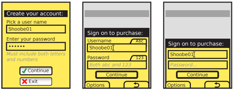
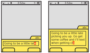
| Form, or sms input area, or... anything you put text... http://patterns.design4mobile.com/index.php/Text_Entr -- NOT a select list, as the entry is free-form | == Problem == A method must be provided for users to enter text and other character-based information without restriction. == Solution == The long-established text and textarea input fields are heavily used to accept user-generated text input in all types of computing. Mobile is no exception, and employs these elements in several methods, with variations to meet the needs of mobile devices. The '''Input Areas''' pattern is concerned largely with differences between the typical implementations of these web or desktop computing form fields, and their most common practices within mobile OSs and applications. For mobile web use of forms, see existing standards from organizations like the W3C for the presentation, interaction and design of these form fields. {{attachment:InputAreas-Labels.png|These three examples show how space can be saved with efficient labeling and hint techniques. However, each compressed item also risk reduced readability and confusion. Field labels inside the form are suitable for single-use forms like this, but should be avoided when pre-populated information or re-visiting of the form is likely. The user may not know what each field is for once the information is entered.|align="right"}} == Variations == Text - Text fields are single-line entry methods. For mobile, these should usually be restricted to only accepting as much input as can be seen in the form, though exceptions may be made, such as for URL entry. Textarea - Textarea field are multi-line entry methods, with a fixed display heights. They are often configured to accept an arbitrary (though not infinite) amount of text, and are provided with a vertical scrolling mechanism to display text which does not fit in the field. Convertible - In certain cases, such as the numeric entry field for the '''[[Dialer]]''', mobile devices may display an entry field that appears to be a Text field, but is in fact a Textarea. This variation is used due to the limited space on mobile devices -- the field is only as large as is needed at any one time, and expands to additional lines as more text is entered. == Interaction Details == Text '''Input Areas''' may only be used while in focus. Focus may be granted by scrolling with '''[[Directional Entry]]''' keys or by direct selection with a pen or finger. Scroll and select devices may require explicit selection of the field by selecting the OK/Enter button. This allows the form to be scrolled through quickly, and only when a field needs to be entered will full focus be granted. While a field is in focus, pressing the OK/Enter key (when available) will perform different functions depending on the context of use. Web forms will work as they usually do for the desktop web. For fields in mobile applications, OK/Enter will generally commit the field, and transfer focus to the next field in the form -- in a mode ready for entry -- or next item in the list. If no other item is available, the entire form will often be submitted instead. Whenever content is known to the system, it should be pre-populated so the user does not have to enter it. Pre-populated content is interacted with just as user-entered text, and may be edited, added-to or removed. When large amounts are pre-populated, a '''[[Clear Entry]]''' item should be provided. {{attachment:InputAreas-Convertible.png|Textareas are essentially identical to text fields, except for the height. Convertible fields, as shown here, only occupy space as needed. |align="right"}} == Presentation Details == Focus of a field must always be very clearly delineated, with border, background or other effects. Cursors must always be used when fields are editable, to denote the state change and the position of the text insertion point. See the '''[[Focus & Cursors]]''' pattern for additional details. An '''[[Input Method Indicator]]''' of some sort should be used to denote the available methods. Labels should accompany the field whenever space provides, and may be abbreviated or iconic to save space. Labels adjacent to the field should be to the left or above the field, and must be close enough to make the relationship clear. Use regular alignment and designed grids to assure clarity. Labels may be placed inside the form field itself. This same method may be used, when labels outside the field are provided, for "hint text" to give information on the type or limits of information to be entered in the field. Label or hint text in the field must be clearly differentiated from actual content (whether user-entered or pre-populated). Typically it will be gray, and may be italicized or a different size to make the difference more clear under all conditions. Content specifics, such as trailing ellipsis may also serve to make this distinction clearer. Labels or hints in the field are not like pre-populated text, and will disappear when focus is granted. When all content is removed from the field (or none has been entered) and focus is removed, the label or hint text will appear again. If hint text is required and the field is not available (due to the label being in the field, or the likelihood of pre-populated information) hint text should appear adjacent to the field, below or to the right. Whenever possible, validate forms at the field level, as they are typed or when the field looses focus (indicating the user has completed entry). Successful validation can be indicated adjacent to the field, near any hint text. Errors in validation, indicating improper entry, should appear in the same location. The relevant hint text, such as field constraints, can be highlighted if space allows. == Antipatterns == Form fields, and especially text '''Input Areas''' are among the most prone to frustration and error due to free-form entry. Design carefully to avoid confusion, and use supporting patterns such as '''[[Autocomplete & Prediction]]''' and the principles of '''[[Cancel Protection]]''' to make entry more efficient and speedy. == Examples == |
Problem
A method must be provided for users to enter text and other character-based information without restriction.
Solution
The long-established text and textarea input fields are heavily used to accept user-generated text input in all types of computing. Mobile is no exception, and employs these elements in several methods, with variations to meet the needs of mobile devices.
The Input Areas pattern is concerned largely with differences between the typical implementations of these web or desktop computing form fields, and their most common practices within mobile OSs and applications.
For mobile web use of forms, see existing standards from organizations like the W3C for the presentation, interaction and design of these form fields.

Variations
Text - Text fields are single-line entry methods. For mobile, these should usually be restricted to only accepting as much input as can be seen in the form, though exceptions may be made, such as for URL entry.
Textarea - Textarea field are multi-line entry methods, with a fixed display heights. They are often configured to accept an arbitrary (though not infinite) amount of text, and are provided with a vertical scrolling mechanism to display text which does not fit in the field.
Convertible - In certain cases, such as the numeric entry field for the Dialer, mobile devices may display an entry field that appears to be a Text field, but is in fact a Textarea. This variation is used due to the limited space on mobile devices -- the field is only as large as is needed at any one time, and expands to additional lines as more text is entered.
Interaction Details
Text Input Areas may only be used while in focus. Focus may be granted by scrolling with Directional Entry keys or by direct selection with a pen or finger. Scroll and select devices may require explicit selection of the field by selecting the OK/Enter button. This allows the form to be scrolled through quickly, and only when a field needs to be entered will full focus be granted.
While a field is in focus, pressing the OK/Enter key (when available) will perform different functions depending on the context of use. Web forms will work as they usually do for the desktop web. For fields in mobile applications, OK/Enter will generally commit the field, and transfer focus to the next field in the form -- in a mode ready for entry -- or next item in the list. If no other item is available, the entire form will often be submitted instead.
Whenever content is known to the system, it should be pre-populated so the user does not have to enter it. Pre-populated content is interacted with just as user-entered text, and may be edited, added-to or removed. When large amounts are pre-populated, a Clear Entry item should be provided.

Presentation Details
Focus of a field must always be very clearly delineated, with border, background or other effects. Cursors must always be used when fields are editable, to denote the state change and the position of the text insertion point. See the Focus & Cursors pattern for additional details.
An Input Method Indicator of some sort should be used to denote the available methods.
Labels should accompany the field whenever space provides, and may be abbreviated or iconic to save space. Labels adjacent to the field should be to the left or above the field, and must be close enough to make the relationship clear. Use regular alignment and designed grids to assure clarity.
Labels may be placed inside the form field itself. This same method may be used, when labels outside the field are provided, for "hint text" to give information on the type or limits of information to be entered in the field. Label or hint text in the field must be clearly differentiated from actual content (whether user-entered or pre-populated). Typically it will be gray, and may be italicized or a different size to make the difference more clear under all conditions. Content specifics, such as trailing ellipsis may also serve to make this distinction clearer.
Labels or hints in the field are not like pre-populated text, and will disappear when focus is granted. When all content is removed from the field (or none has been entered) and focus is removed, the label or hint text will appear again.
If hint text is required and the field is not available (due to the label being in the field, or the likelihood of pre-populated information) hint text should appear adjacent to the field, below or to the right.
Whenever possible, validate forms at the field level, as they are typed or when the field looses focus (indicating the user has completed entry). Successful validation can be indicated adjacent to the field, near any hint text. Errors in validation, indicating improper entry, should appear in the same location. The relevant hint text, such as field constraints, can be highlighted if space allows.
Antipatterns
Form fields, and especially text Input Areas are among the most prone to frustration and error due to free-form entry. Design carefully to avoid confusion, and use supporting patterns such as Autocomplete & Prediction and the principles of Cancel Protection to make entry more efficient and speedy.
