This has been massively updated since the simple guidelines in the book, then I made it illustrated and readable for an article in UX Matters magazine. This entry includes all that, and some other notes.
Touchscreens have been with us for decades—and they’ve been the mobile input method of choice for many of us for about 5 years. In fact, many junior designers and developers—or at least those who were late to the mobile party—have never owned a mobile phone for which buttons were the primary input method.
But there are still very few designers who seem to know how touchscreens actually work or how people really interact with them. In my work as a UX design consultant, working for many different organizations, I’ve encountered lots of myths and half-truths about designing for touchscreens.
You Can’t Rely on Designing 44-Pixel Touch Targets
Even with iOS clearly in second place behind Android, the Apple standard size for touch targets sticks with us, but 44 pixels is not a physical size. And with several device operating systems on the market—and Apple converting pixels to a device-independent measurement they call a point—we cannot even translate 44 pixels, or points, to a single actual size.
Physical sizes matter, so all good guidelines are in millimeters, inches, typographers’ points, or other real-world scales.
Plus, a lot of the guidelines for operating systems and OEMs (Original Equipment Manufacturers) define touch targets that are smaller than the vast body of research indicates would be correct. For example, Nokia often insists that 7 millimeters is a fine size for touch targets, and so does Microsoft—sort of—but they also say that there should be 2-millimeter gaps between targets. Other guidelines are all over the place. ANSI/HFES 100-2007 recommends a button size of at least 9.5 millimeters.
When designing targets in touch user interfaces, we can neither define them using a single number of pixels nor consider only a single axis of their size.
Do Different Finger Sizes Really Matter?
Looking at touch-target size differently, ISO 9241-9 recommends a button size equal to the breadth of the distal finger joint of a 95th percentile male, which is about 22 millimeters! But many people touch mobile-device screens with their thumbs.
A number of touch-target guidelines are based on measurements of the widths of people’s fingers, but such measurements are mostly irrelevant. Sure, we do have fingers of different sizes, but when using capacitive touch devices, only part of the finger or thumb makes contact with the screen, as Figure 1 shows.
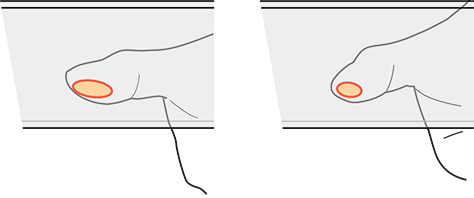
Because our fingers are three-dimensional and compliant, or squishy, the contact patch varies by pressure and angle. Some research has suggested that users slow down and use more precise touch methods when targets are smaller—such as touching screens with their fingertips. Plus, when trying to exert more control, users touch more lightly, so have a smaller contact patch. It may even be possible to sense and take advantage of this in the near future. In my own research, I have found that children seem to have less control than adults, so despite their having smaller fingers, they have a contact patch of about the same size as an adult’s.
You may be surprised to learn that current touchscreens sense only the geometric center of a user’s contact patch, or its centroid, rather than its entire area, as shown in Figure 2. So touchscreens can’t communicate the size of a user’s contact patch to a mobile phone—or your Web site or app. Because a device uses only the centroid to determine what a user is tapping, the extent of the contact patch doesn’t matter.
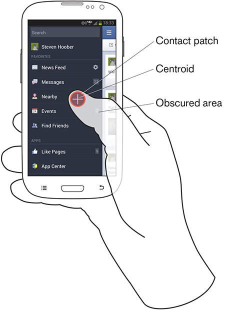
Luckily, people know their own hands well and are pretty good at centering a touch on a target, so they can generally place the centroid of contact where they mean to. In Figure 2, the contact patch overlaps the items Nearby and Events, but the centroid is clearly on Nearby, so that is the target that gets tapped.
Of course, finger size can matter when a user’s finger is obscuring a user interface, but this is a different problem from finger size as it relates to touch targets. In this case, the part of the screen that a hand obscures depends on how users hold their phone.
Bigger Buttons Are Easier to Use—Up to a Point
When the target is a button, the bigger, the better—but only up to a point. Over a certain size—and a surprisingly small size really—research tells us that there’s no improvement in the accuracy of touch interactions. If buttons get too big, users start having problems perceiving them as clickable buttons—and sometimes even discerning them as discrete elements.
The belief in big buttons is also troublesome because it makes plain the general perception that visible targets and touch targets are the same thing. While this may often be true in practice, this perception is where many design issues arise. In actuality, to get a bigger target, there’s no need to increase the size of the visible target. Instead, you can simply increase the dimensions of the clickable area around a link or button.
As for any interactive element, the sizes of the visible target and the touch target for a button can be different. More often than not, they should be.
Designing Targets
There are, in fact, three facets of touch targets that we must understand and consider when designing touch interfaces:
- designing visual targets
- designing touch targets
- preventing interference errors
Designing Visual Targets
The visual target is the link text, icon, or other graphic element that affords an interaction. Visual targets need to be big enough and clear enough so:
- They attract the user's eye.
- The user understands that they are actionable elements.
- They are readable, and the user can understand what action they will perform.
- The user is confident that he can easily tap them
The most common issues with visual targets arise from users’ expectations of what a target should be. For example, in a list or table, if rows have visible backgrounds or separator lines, users generally expect the whole box—that is, the cell or row between those lines—to be the target. So don’t make just the text the target. Design containers and indicators to attract taps as well. And be sure to use separators or containers whenever possible.
Always design visible targets to display multiple states. Many errors arise from minor delays in responsiveness. If users don’t get immediate feedback that a tap was successful, they will assume a miss and try again. As soon as a device accepts a touch, the visible target should change to an active state that is clearly different from its default state. Don’t forget about the issue of the user’s thumb or finger obscuring the target. Ensure that the change of state occurs in a visible area that is large enough for the user to see it.
For human vision, what matters most is not font sizes, but the angle of vision, which is referred to as angular resolution. In Figure 3, the narrow cone shows the minimum size for legible type; the larger cone, the area of high-resolution vision where the user’s eyes are focused. Devices that a user is viewing from further away require larger text.
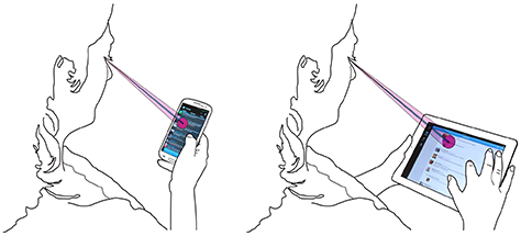
Minimum font sizes must meet three criteria: the text must be readable, legible, and tappable. Calculations of angular resolution and distance, as shown in Figure 3, indicate that a 6-point (pt), or 2.1-millimeter (mm), font size is generally the smallest that allows readability. Icons should not be smaller than about 8 points, or 2.8 millimeters, unless they directly reinforce the text—for example, an indicator that a link loads a page in a new window. People with low vision need larger visual targets.
There’s a maximum size for visual targets as well. It is convenient—though not completely accurate—to say that our area of attention is much smaller than our field of view. The cone representing our foveal vision is about 5 degrees across—or a circle that is approximately half the size of your fist at arm’s length. This is also—not by coincidence—the angular dimension of most mobile handsets, but is much smaller than a tablet’s screen. So buttons or other tappable elements that extend across the entire viewport are often so big that users cannot perceive them as actionable items.
If you think banner ads don’t have this problem, take a closer look. Most contain smaller call-to-action buttons or links for the express purpose of solving this problem. Make sure your visual targets are small enough to be within the user’s attention zone.
Note — Unless otherwise stated, the specific guidelines I’ve provided here are for mobile phones. People use tablets, computer screens, and video players at greater distances, so depending on the size of the screen and the expected use case, you’ll need to design larger visual targets for them. People generally hold smaller mobile devices—such as most feature phones—closer, so you can use even smaller sizes for visual targets. Be sure to calculate the angular resolution and test for readability on real hardware, with real people.
Designing Touch Targets
An area on a screen that a user can touch to perform an action is a touch target. Touching a device’s screen outside a touch target does not activate the target.
As I mentioned earlier, a target’s visual design drives users’ expectation of its size. If users could reasonably expect an entire button or other element to be tappable, make it so. I encounter too many buttons where only the text is the touch target and tapping the rest of the button does nothing.
Since touchscreens sense only the centroid, or geometric center of the contact patch, the contact patch of a user’s finger is not as relevant in determining touch targets as you might think. To determine how small a touch target can be without impairing usability, I have reviewed much literature and done some math relating to what is called the circular error of probability (CEP).
Any targeting has inherent inaccuracy. A user’s actual touches on an intended target are never all perfectly aligned; they’re distributed around the target. Their distribution is not random, but closely clustered around the visual target. By measuring their inaccuracy, you can determine the CEP as a certain percentage of hits and determine whether users can hit a target of a certain size with acceptable accuracy.
Over about a 95% accuracy, there begin to be diminishing returns—much larger targets are necessary for a small improvement—so I’ve used a CEP of R95 to determine sizes.
Text links are far too small to accurately target them. Some modern operating systems and browsers such as Google Chrome attempt to solve this problem by zooming in on small, ambiguous targets, to offer suitably large tappable areas.
However, the visual target does not have to be the touch target—and usually should not be. For example, say a mobile site needs to have a very small, 6-point text link to a disclaimer or the full site. The text should be small because you don’t want people to notice it much; but since it’s small, it may be hard to activate.
No problem. First, not only should the visible link text be clickable, the normally invisible area around it should also be clickable. (You can see a link’s clickable area if you drag your finger across the text to select it.)
If a link were in 6-point Helvetica, a box corresponding to its clickable area would be 7.68 points, or 2.7 millimeters, tall. That is still far, far too small to be easily tappable. Users might encounter error rates as high as 50% with a target this small.
The absolute minimum for a reliable touch target is 6 millimeters, but this is suitable only when users are relatively still. If users may either be moving or distracted, use an 8-millimeter target. Smaller targets would cause a user to slow down, which might not be acceptable for your user interface. There is never any need to exceed 15 millimeters for a touch target.
Depending how you measure the centroid of a touch, it can sometimes appear that the centroid tends to be below the centerline of the visible target. Although this is technically accurate, calculations of the more useful interpretations of CEP (D2RMS or R95) don’t bear this out. There is not a statistically significant difference between measuring the number of equally distant high clicks and low clicks that are close to the center. I am comfortable adding this phenomenon to the myths of mobile design, because it has no influence on design.
Preventing Interference Errors
Making sure a touch target is the right size means ensuring a user can tap it. When a user fails to tap a touch target accurately, it results in a miss, and the target doesn’t activate. What happens when users miss a touch target is a key factor to consider. People actually miss every target by a little, so planning for error is crucial.
But the error that has the most serious consequences is interference, the condition that happens when two or more touch targets are in such close physical proximity that the circular error of probability for one target includes another target as well.
Be sure to check for interference on each axis of a target. To avoid interference errors, make sure that touch targets are at least 8 millimeters apart on center—with 10-millimeter spacing being strongly preferable. On center is an engineering term that means when measured from the center of each touch target. In this way, you can be measure the distance between the centers of differently sized objects such as a link and a button, because neither the visual- nor the touch-target sizes matter in this measurement.
As a consequence, most touch targets will never be too closely adjacent to each other, and only small amounts of space are necessary between them. This space does not have to be visually apparent. A non-touch area need not necessarily be whitespace. For example, toolbars often comprise icons that have suitable spacing, but without any visual indication of the gap between them. And the height of a tab bar can be as narrow as you want visually, as long as no other targets are too close either above or below the tabs.
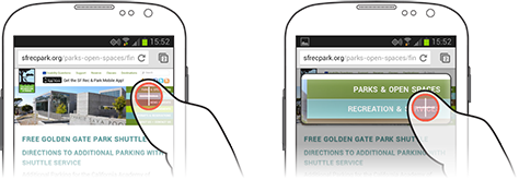
Whether on an actual screen or a scaled screenshot, overlay a circle on each target to check for interference, as shown in Figure 5. In this case, the outer circle is 10 millimeters, while the inner circle is the minimal 8 millimeters. The lists in both screenshots are minimally acceptable. But the very small tab bar in the screenshot on the left would cause interference errors because users could accidentally tap either the action icons above it or the list items below it.
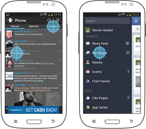
Avoiding disaster is the other part of designing for interference. It is often impossible to space touch targets far enough apart to avoid accidental tapping altogether. In some cases, operating system standards demand overly small and immediately adjacent targets. Tactics to mitigate such problems are relatively easy to implement.
Never place buttons with catastrophic consequences—or even just hard to undo results—near those that have trivial results. For example, in a user interface that lets users compose an email message, the Send and Delete buttons should be far from each other, and nowhere near things like formatting features. Accidentally changing text to bold can be easily fixed by clicking the Bold button again. But there’s no way to unsend a message, and recovering a deleted message requires digging around in the trash, if it’s possible at all.
On mobile devices, interactive elements simply are close to each other, so making mistakes when tapping or performing other gestures will happen. Luckily, our usual design practices already remedy this problem to a great extent. We take the time to group functions by behavior. We avoid visual design errors that would place targets too close to each other or give items of dissimilar importance the same visual weight or proximate locations.
I encourage interested readers to further explore the technology of touchscreens to better understand their capabilities and limitations. To give you one example, inaccuracies can also arise from the design of touchscreens, which varies widely among devices. Some have notable errors on certain parts of the screen. As we begin to gain a better understanding of these technical limitations, this may enhance our ability to prevent errors by avoiding detailed touch interactions in low-resolution parts of the screen.
Designing Gesture and Motion
This article has focused on designing touch interactions that involve tapping—and perhaps, pressing and holding. There has been less research on how the ergonomic factors that I’ve described apply to gestures.
For example, designing a volume slider that would be easy to use would clearly have the same requirements as any basic touch interaction in regard to pressing and holding the control. But further considerations would immediately arise when a user moved his finger on the screen to drag the control. Specifically, it would be necessary to restrict the directional movement to a single axis—or a particular angle or type of motion. In the case of a horizontal volume slider, once the user activated the control, the application would ignore any finger movement in the vertical axis. This is a good way to let users move controls with greater precision.
Other types of gestural interactions require similar, but slightly different guidelines. As with design for touch, there are many misconceptions about best practices for the design of gestures, which are neither well defined nor well understood. So think carefully about the needs of users when designing gestures. Hopefully, in addition to an increasing body of actual best practices for the design of gestures, there will soon be more solid research that will let us learn more about designing gestures.
Summary of Touchscreen Design Guidelines
I’ve explained a lot of different design considerations in this column, so I’ll summarize the key steps that you should take when designing or evaluating a design for a touch user interface:
- Determine the size of each visual target.
- Determine the size of each touch target—and define it in your design specification!
- Evaluate touch targets for possible interference errors. If small targets are too close together, adjust their size and spacing.
- Determine the consequences of accidental taps on adjacent targets. If they’re severe, protect users from them by rearranging targets or placing them further apart.
Summary of Size Guidelines
For your easy reference, here is a summary of the size guidelines I’ve provided throughout this column—including minimum sizes for visual targets on devices of various sizes, in Table 1; sizes for touch targets; and the minimum and preferred spacing between adjacent targets—as measured on center, on either axis—to avoid interference errors.
Minimum sizes for visual targets on various device sizes
Target |
2.5-inch Phone |
3.5–5-inch Phone |
9–10-inch Tablet |
Text |
4 pt / 1.4 mm |
6 pt / 2.1 mm |
8 pt / 2.8 mm |
Icons |
6 pt / 2.1 mm |
8 pt / 2.8 mm |
10 pt / 3.5 mm |
Touch targets:
Minimum |
17 pt / 6 mm |
Preferred |
23 pt / 8 mm |
Maximum |
43 pt / 15 mm |
==== Spacing between targets to avoid interference errors, on center:====
Minimum |
23 pt / 8 mm |
Preferred |
28 pt / 10 mm |
Try this out
On Android, you can turn on a debug mode that shows your touches as little circles on the screen. Turn it on, and try it out. Even just observing yourself, you will notice how often your touches are not to the center of the target. If you miss, especially, notice where you touched. Swype also has a trace mode which leaves orange lines over the keyboard for your trace; the inaccuracy is very interesting to watch.
Think about that when you next design an interactive element, and make sure the targets are big enough, and most of all that they are spaced out enough.
And, put designs on screen and try measuring, using Touch Templates and so on.
Clicks below target
Depending how you measure, it sometimes appears as though the centroid of a touch click will tend to be below the centerline of the visible target. Though this is technically true, calculations of the more useful interpretations of CEP (D2RMS or R95) don't bear it out; there are enough equally-distant high clicks, and the low clicks are so close to the center as to not account for for a statistically significant difference.
Let's talk about statistical significance for a moment. Yes, you can cut the data to show a slight preference for low-clicks. But at the accuracy we are talking about, all the clicks are well within the target area. The low preference is, statistically, just noise.
As long as the general guidelines above are followed, I cannot suggest making click targets or spacing for interference prevention larger on the bottom to account for this targeting error.
Tolerance Stacking
I need to take the time to do the math, but it seems there would be collisions between the inaccuracy of touch points and the inaccuracy resulting from limits in the precision of touchscreens. Touchscreens (as we use them now: mutual, projective capacitance) are not perfectly precise, but are composed of a grid of sensors and a lot of algorithms to fake extra accuracy.
There are, if not dead spots, areas where the touch will be detected as in a slightly different location. So, if you make excessively-small, closely-spaced links, some cannot be selected in some positions. This may or may not matter if the minimum sizes above are followed anyway.
Barleycorns
The old English unit of the barleycorn, nominally the length of the part of a plant, is exactly 1/3rd of an inch, and ends up being very close to the ideal size for interference avoidance, which can be used as a touch target as well.
Test for touch target compliance
There's a blog post up here where I discuss how to apply these guidelines, with specific hints on using templates as guides to observe interfering interaction elements.
http://shoobe01.blogspot.com/2011/10/web-to-mobile-testing-how-well-it-will.html
And... of course this evolved into the 4ourth Mobile Touch Template which you can just go and buy.
This is Not (Yet) An Interaction Guideline
For example, there's much to be discussed about press-and-hold to get context menus and considering tradeoffs therein. Or gestures, etc. Some is discussed elsewhere in the book (links need to be added here) but I can see this all getting more specific these days since we're getting pretty standard on some of this. Someone remind me.
Next: Fitts' Law
Technical References
By which I mean "hardware." It can help a lot to understand how these systems work. This is mostly not very simple stuff.
More References
For now, just gathering. But there are a few papers that are new, which I missed before, etc. and I want to pull them all in and see what they say:
http://msdn.microsoft.com/en-us/library/windows/apps/hh465415.aspx#touch_targets Good discussion of MS touch and grasping info. They still confuse finger size with contact patch and say 7 mm. Too small.
Touch screen user interfaces for older adults: button size and spacing - No full text on ACM.
Effect of touch screen button size and spacing on touch characteristics of users with and without disabilities - Found 20 mm buttons worked best and larger spacing didn't help, but they measured force used, not targeting accuracy, I guess for the disabled cohort. May not be helpful to us.
Elderly user evaluation of mobile touchscreen interactions - No full text on ACM
Target size study for one-handed thumb use on small touchscreen devices - "target size of 9.2 mm for discrete tasks and targets of 9.6 mm for serial tasks should be sufficiently large for one-handed thumb use on touchscreen-based handhelds" - CEP-R95 with no improvement from increasing to 11.5 mm. Mostly conflates target and interference, putting the test items very often adjacent to each other. Quoted by Nielsen in Mobile Usability (2012) as a round 10 mm, which works for me (it's my suggested touch target size also).
The Performance of Touch Screen Soft Buttons -- 10 mm buttons got 98 - 99.4% accuracy. Reducing button size caused users to switch from thumb to finger. iPhone keyboard (wide: 7.2 mm (W) x 6.5 mm (H), Narrow: 4.9 mm x 8.3 mm) had high 90% accuracy, but 1/3rd slower speed, and there was a huge jump in corrections required on the narrow kb. I think they measured accuracy as the ability to enter the right value, not the /first time/ ability to hit the right target.
Touch key design for target selection on a mobile phone - All thumb, cradle if needed. NOTE charts of convenience, errors, success are different, and do not align with current popular sweep diagrams. Sizes: larger is better, 10 mm better than 7, 4 sort of a disaster.
Legible Character Size on Mobile Terminal Screens: Estimation Using Pinch-in/Out on the iPod Touch Panel - No full text on ACM.
A Touch Screen Button Size and Spacing Study with Older Adults - No full text on ACM
Interacting with multi-touch handheld devices in augmented reality spaces: effects of marker and screen size -- Not very relevant.
An empirical study on the smallest comfortable button/icon size on touch screen -- No full text on ACM
Investigating selection and reading performance on a mobile phone while walking -- "whilst performance decreases, cognitive load increases significantly when reading and selecting targets when walking. Furthermore, the results show that the negative effect regarding target selection can be compensated by increasing the target size, but the text reading task did not yield better perform ance results for a larger text size due to the increased demand for scrolling." -- 6.74mm buttons up to 23% error, 10mm-ish buttons are much better, 20mm solve almost all problems when walking. Small buttons make people slow down, as well due to cog loading -- Small text (6pt) has no performance degradation when walking, but is perceived by some as being worse; there is a middle ground due to the need to scroll, too large a text size is also bad.
100,000,000 Taps: Analysis and Improvementof Touch Performance in the Large -- Several million somewhat-qualified clicks from a game on Android, "Below 15mm the error rate dramatically increases and jumps to over 40% for targets smaller than 8mm." See charts on Fig 7 for error rates by position: basically, the edges are much worse, pretty symmetrically. See Fig 10 about offsets: MAYBE parallax induced, with users aligning their eye to the natural fall of their thumb, and all other positions are distorted.
Hey, that's not who I voted for!: a study on touchscreen ballot design - Recent, still conflating target and interference as all tested designs have buttons hard against each other. Anyway, not size focused as much as indicator/visual-target focused. Discusses labels attracting clicks, checks to indicate selection, etc.
- Sears, A. Improving touchscreen keyboards: Design issues and a comparison with other devices. Interacting with computers 3 (1991) -- Summarized by others: "Early research focusing on xed touchscreens mounted on a table showed that users touch slightly below the actual target if the screen is tilted away from the user and that they touch above the target if its tilted towards the user" This may result from parallax, so may be correctable by users with exposure to the system.
The Pursuit of Tappiness : Six Easy Ways to Make Your Website Tablet-Friendly Terrific counter example. Just read the comments. Of course you don't specify in pixels, are you crazy? Plus, measuring fingers is not the same as measuring touch areas. At all. Jeesh.
- ANSI/HFES 100-2007 recommends a button size of at least 9.5 mm
- ISO 9241-9 (ISO, 2000) recommends a button size equal to the breadth of the distal finger joint of a 95th percentile male (approximately 22 mm to 23 mm; Greiner, 1991) which is crazy! Contact patches are not your full finger!

