|
Size: 27305
Comment:
|
Size: 27690
Comment:
|
| Deletions are marked like this. | Additions are marked like this. |
| Line 2: | Line 2: |
''This whole essay is in the book, then I added to it, then I made it illustrated and readable for an article in [[http://www.uxmatters.com/mt/archives/2013/03/common-misconceptions-about-touch.php|UX Matters]] magazine. I'd go there, for now. Eventually I'll move that info over here, and make it match this format, so you can come one place and we can keep it all up to date.'' |

This whole essay is in the book, then I added to it, then I made it illustrated and readable for an article in UX Matters magazine. I'd go there, for now. Eventually I'll move that info over here, and make it match this format, so you can come one place and we can keep it all up to date.
Before I get to the numbers, there are some issues with understanding what the numbers mean. I see this in serious, academic work as well as day-to-day designs, so pay attention.
Visual Target
The words, buttons and rows in a list are visual targets. They need to be big enough and clear enough to attract the user's eye and give them confidence that it's an actionable item, and that they can hit it. Issues with visual targets are mostly around what the target is. In a list or table, if you have rows with visible backgrounds or separator lines, then the user expects the whole box (the row or cell) to be the target. Don't just make the word the target. Design your containers and indicators to attract clicks as well.
Minimum - Minimum sizes must meet three criteria, readable, legible and selectable. 6 pt (2.1 mm) is the smallest text that can generally be used for readability (on handsets, tablets and other computers used further away will always need larger sizes). Icons should not be smaller than about 8 pt (2.8 mm) unless they are reinforcing the text directly (e.g. link offsite indicator). These both may be too small for many populations, and for larger devices. The calculations shown separately can be used to determine the smallest suitable size by taking into account the ability of users to move the device closer to their eyes.
Maximum - Yes, for visual targets, there's a maximum size as well. Although not perfectly true, it's convenient and a moderately accurate model to say that our attention is a cone much smaller than our field of view. You can represent that by a circle about the size of your fist at arm's length. This is also (not by coincidence) the angular size of most mobile handsets, but is smaller than a tablet screen. Buttons or other selectable elements that extend across the entire viewport will often be so big they cannot be perceived as actionable items by the user. If you think that banner ads don't encounter this problem, note they have call to action buttons and links, which were developed to solve this issue by being smaller. Make sure your visual targets are small enough to be within the user's attention zone.
Another note about touch targets, pointed out in Nielsen's Mobile Usability book just now to me, is that active states of buttons need to be visible. First, yes, when you click a button (link, etc.) it should have an active state so the user knows it's been selected. But that needs to be big enough the user can see it. Around their finger. Remember, fingers are not transparent, so get in the way of seeing stuff. Yeah, you can cheat a little with haptics (if it vibrates a bit, you might figure it out) but that says you clicked A key, not which one.
Touch Target
However, that visual target does not have to be the touch target, and usually should not be.
Say you have a very small piece of text, a 6 pt link to the disclaimer or the full site. Clearly small because you do not want people to notice it much so it's small. But it's also so small it may be hard to activate.
No problem. First, text is not clickable where it is visible, but over a normally invisible area around it. You can see this if you drag over it to select the text. For 6 pt Helvetica this is a box 7.68 pt (2.7 mm) tall. That is still far, far too small to be easily selected. Error rates as high as 50% might be encountered with a target this small.
Solving this is easy. You probably already have it inside a transparent, borderless box just to position it, in a list or otherwise. Make the box the linked item. The text is just a visual indicator. Of course, watch accessibility, and make sure the linked item has proper data attached to it, etc.
The absolute minimum touch target is 12 pt, or 4.25 mm. If at all possible, make the target larger, but there is no need to exceed 15 mm.
DIAGRAM will cover very simply how the half-CEP calculations of touch contact patch allow smaller targets so it's okay. But only if there's no interference!
Interference
But all that is about targets on their own. This is not the usual problem. The guidelines I have below, or which are on the Touch Template, are entirely about interference.
This is because the biggest issue with touch size is not the size of the target, but how close it is to other targets. If you put a button immediately adjacent to another, it must be much larger than if you put space between them.
Always consider the effect of missing the target. Does it activate another target, or hit dead space and have no effect? If it hits another target, what is the result? If it just changes a switch or opens a menu, that's not as big a deal as following a link. Or nearly as big a deal as submitting your email when you actually wanted to delete it.
Interference sizes are 8 mm minimum, 10 mm preferred, and larger if possible. The largest size is not clear at this point. I'll have to do math or research to determine one.
A better way to refer to it: 8 mm or 10 mm on center. An engineering method of referring to spacing and locations. Studs in your house are 16" on center. Measuring to closest edges gives a weird measure, measuring to equivalent sides (always the left) allows tolerance changes to affect the measure. Since for our purposes we want to check for interference with dissimilar items (a link next to a button) centers are important.
(DIAGRAM needs to come from this to accompany the use of a Touch Template to measure it directly).
Position
Many of these guidelines apply similarly to mouse-driven interfaces as well, but touch has additional drivers in that the user is directly interacting with the screen. We have to make sure their hand can get to the screen, comfortably, and repeatedly. A classic issue is the "gorilla arm" which results from fatigue if using an unsupported touchscreen. Imagine using an ATM all day for work. Touchscreen desktops and laptops may fall in the middle, and be usable but good data is yet to be gathered.
Mobiles are grasped for the most part, so that is not an issue. Josh Clark is the forefather of strongly espousing the idea that everyone holds their device with one hand, so all touch targets should be within a thumb sweep range of the lower-right corner. I am gathering data right now that is indicating this is by no means universal, but that is a discussion for another article.
Centroids
Your finger has no size to the handset. It's only perceived as and used as a point. Not even a pixel. My understanding is that this is not even calculated, but is a function of the electrical phenomenon used to sense the screen.
The sizes we discuss are a function of obscuring (your finger is opaque) and targeting accuracy (as well as some parallax issues). There is a good correlation to size of pointer and size of pointing accuracy, which is another reason pen devices have some advantages.
Checklist for designing touch targets
This varies a lot based on the service you are designing, how users employ it, on what type of device, and what the individual actions do. But too much design only goes to step 1. You have to consider all of it.
- Determine the sizes of each visual target
- Determine the size of each touch target (and define it in the specification!)
- Evaluate for interference. If small targets are touching, fix it.
- Determine the consequences of accidental clicks on adjacent targets. If bad, fix it by rearranging or re-spacing.
It's all about tradeoffs
This information is being presented like a pattern. When you ask for numbers, I give you the best practice and you can use that pretty safely. But if you have other constraints, look closer and follow the references, and you will have info to start making your own choices, by making tradeoffs.
For example, the iOS keyboard in portrait is very small. Key are only about 4 mm wide. And in studies (see some below) this has a notable dropoff in accuracy. But, what else are you going to do if you need a keyboard? And, it's a keyboard, so one mistake is frustrating, but can be easily corrected so isn't a catastrophe.
People will mitigate for you a bit. They will slow down, switch from thumbs to fingers (not sure if this is more accurate, but it's perceived to be), and so on. If you have space constraints, can you live with slower speed, periodic frustration, etc.? Maybe. I can't tell you.
Try this out
On Android, you can turn on a debug mode that shows your touches as little circles on the screen. Turn it on, and try it out. Even just observing yourself, you will notice how often your touches are not to the center of the target. If you miss, especially, notice where you touched. Swype also has a trace mode which leaves orange lines over the keyboard for your trace; the inaccuracy is very interesting to watch.
Think about that when you next design an interactive element, and make sure the targets are big enough, and most of all that they are spaced out enough.
And, put designs on screen and try measuring, using Touch Templates and so on.
General Touch Interaction Guidelines
The minimum area for touch activation, to address the general population, is a square 3/8 of an inch on each side (10 mm). See Figure D-1. When possible, use larger target areas. Important targets should be larger than others.
There is no distinct preference for vertical or horizontal finger touch areas. All touch can be assumed to be a circle, though the actual input item may be shaped as needed to fit the space, or express a preconceived notion (e.g., button). Due to reduced precision and poor control of pressure, but smaller fingers, children who can use devices unassisted have the same touch target size.

Targets
The visual target is not always the same as the touch area. However, the touch area may never be smaller than the visual target. When practical (i.e., there is no adjacent interactive item) the touch area should be notably larger than the visual target, filling the “gutter” or whitespace between objects. Some dead space should often be provided so that edge contact does not result in improper input.
In the example shown in Figure D-2, the orange dotted line is the touch area. It is notably larger than the visual target, so a missed touch (as shown) still functions as expected.

Touch Area and the Centroid of Contact
The point activated by a touch (on capacitive touch devices) is the centroid of the touched area; that area where the user’s finger is flat against the screen.
The centroid is the center of area whose coordinates are the average (arithmetic mean) of the coordinates of all the points of the shape. This may be sensed directly (the highest change in local capacitance for projected-capacitive screens) or calculated (center of the obscured area for beam sensors).
A larger area will typically be perceived to be touched by the user, due to parallax (advanced users may become aware of the centroid phenomenon, and expect this). See Figure D-3.

Bezels, Edges, and Size Cheats
Buttons at the edges of screens with flat bezels may take advantage of this to use smaller target sizes. The user may place her finger so that part of the touch is on the bezel (off the sensing area of the screen). This will effectively reduce the size of her finger, and allow smaller input areas.
This effective size reduction can only be about 60% of normal (so no smaller than 0.225 inch or 6 mm) and only in the dimension with the edge condition. This is practically most useful to give high-priority items a large target size without increasing the apparent or on- screen size of the target or touch area. See Figure D-4.

Mobile Touch Template
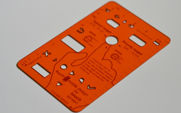
Get beyond designing for pixels.
If you are designing for mobiles, but never get out from behind Photoshop or Fireworks, it's time. Put your design on the handset, as early as possible, and evaluate it at the scale people use it. Then, stop relying on your eyes and judgment, and get measuring tools, and follow good mobile design guidelines.
This template is a tool specifically for measuring touch targets and type sizes on mobiles. Find out more
Next: Fitts' Law
Discuss & Add
Please do not change content above this line, as it's a perfect match with the printed book. Everything else you want to add goes down here.
Where this info came from
When I first needed to know touch target sizes, there were basically no guidelines, at least from a digital POV. Apple had their 44px thing, but it seemed rather suspiciously non-physical.
So, I did primary research. Without funding, I had to do "friends and family" but indeed grabbed everyone I could (over 150 individuals as I recall) at a couple parties, sent the interns off to grab all their friends and classmates, etc. The methodology involved a target printed on a piece of paper, which the user touched with an inked (inkpad) finger.
This is how not only did we come up with sizes, but other good observations like:
- The pad of the finger, though apparently vertically-oriented, doesn't always flatten like that.
- Also, many people do not hit the target vertically.
- Children have the same touch target as adults. I gather due to the excessive force used, their fingers flatten out more.
- No other differences in age, sex, experience, etc. Fingers are fingers.
Hence, a circular target of the size we say. The data gathering, along with subsequent observations of applying these specifications, make me very confident of them. The edge-usage sizing, for example, was a theory until we applied it and checked in a lab. First try I made them too small (there was a math reason), so am sure of the 60% size. Similarly, the 10 mm suggested target has a statistically-notable improvement in click reliability, so I use that.
This was done with the finger, not the thumb, so that may be an issue. Thumbs are not universally used, but are more common than fingers so should be accounted for. I am working on it.
I am also now reading a whole bunch of other research and will be doing a sort of low-statistics meta-study to confirm these findings. I will continue to write about it further, and improve or modify things.
Other Guidelines
44 pt - Apple. An apple "point" is a device-independent-pixel, originally the same as 44px on the "non retina" displays of the early iPhone and iPod Touch. This ends up being rather too small, at 6.74 mm on the iPhone, but also is increasingly variable based on device scaling ratios. Most critically of late (late 2012) is that the iPad Mini draws everything by pretending it is a full-sized iPad, so all items appear smaller. Even touch targets, and this seems to not be working, as you might imagine. Need link
7 mm - Nokia. This is too small. I am pretty sure they took my 8 mm recommendation a few years ago (they did reproduce other wiki articles I wrote, with -- eventually -- permission) but the touch target size has been degrading over time. They also only account for 1 mm gaps between items. This makes the interference target 7.5 mm, so just barely acceptable and that may be why they are coming up with it; they may have proved it themselves in a lab setting, where conditions were too ideal. Need link
7 mm? - Microsoft. More importantly, they also are one of very, very few to discuss spacing items. They say 2 mm between, but that's not the way I prefer to say it. Still, better than nothing. Need link http://www.istartedsomething.com/20120223/microsoft-offers-touch-guidance-to-windows-8-metro-app-developers/ They also discuss finger width as being 11 mm, but as we've said, that's not important.
Clicks below target
Depending how you measure, it sometimes appears as though the centroid of a touch click will tend to be below the centerline of the visible target. Though this is technically true, calculations of the more useful interpretations of CEP (D2RMS or R95) don't bear it out; there are enough equally-distant high clicks, and the low clicks are so close to the center as to not account for for a statistically significant difference.
Let's talk about statistical significance for a moment. Yes, you can cut the data to show a slight preference for low-clicks. But at the accuracy we are talking about, all the clicks are well within the target area. The low preference is, statistically, just noise.
As long as the general guidelines above are followed, I cannot suggest making click targets or spacing for interference prevention larger on the bottom to account for this targeting error.
Tolerance Stacking
I need to take the time to do the math, but it seems there would be collisions between the inaccuracy of touch points and the inaccuracy resulting from limits in the precision of touchscreens. Touchscreens (as we use them now: mutual, projective capacitance) are not perfectly precise, but are composed of a grid of sensors and a lot of algorithms to fake extra accuracy.
There are, if not dead spots, areas where the touch will be detected as in a slightly different location. So, if you make excessively-small, closely-spaced links, some cannot be selected in some positions. This may or may not matter if the minimum sizes above are followed anyway.
Barleycorns
The old English unit of the barleycorn, nominally the length of the part of a plant, is exactly 1/3rd of an inch, and ends up being very close to the ideal size for interference avoidance, which can be used as a touch target as well.
Test for touch target compliance
There's a blog post up here where I discuss how to apply these guidelines, with specific hints on using templates as guides to observe interfering interaction elements.
http://shoobe01.blogspot.com/2011/10/web-to-mobile-testing-how-well-it-will.html
And... of course this evolved into the 4ourth Mobile Touch Template which you can just go and buy.
This is Not (Yet) An Interaction Guideline
For example, there's much to be discussed about press-and-hold to get context menus and considering tradeoffs therein. Or gestures, etc. Some is discussed elsewhere in the book (links need to be added here) but I can see this all getting more specific these days since we're getting pretty standard on some of this. Someone remind me.
Technical References
By which I mean "hardware." It can help a lot to understand how these systems work. This is mostly not very simple stuff.
More References
For now, just gathering. But there are a few papers that are new, which I missed before, etc. and I want to pull them all in and see what they say:
http://msdn.microsoft.com/en-us/library/windows/apps/hh465415.aspx#touch_targets Good discussion of MS touch and grasping info. They still confuse finger size with contact patch and say 7 mm. Too small.
Touch screen user interfaces for older adults: button size and spacing - No full text on ACM.
Effect of touch screen button size and spacing on touch characteristics of users with and without disabilities - Found 20 mm buttons worked best and larger spacing didn't help, but they measured force used, not targeting accuracy, I guess for the disabled cohort. May not be helpful to us.
Elderly user evaluation of mobile touchscreen interactions - No full text on ACM
Target size study for one-handed thumb use on small touchscreen devices - "target size of 9.2 mm for discrete tasks and targets of 9.6 mm for serial tasks should be sufficiently large for one-handed thumb use on touchscreen-based handhelds" - CEP-R95 with no improvement from increasing to 11.5 mm. Mostly conflates target and interference, putting the test items very often adjacent to each other. Quoted by Nielsen in Mobile Usability (2012) as a round 10 mm, which works for me (it's my suggested touch target size also).
The Performance of Touch Screen Soft Buttons -- 10 mm buttons got 98 - 99.4% accuracy. Reducing button size caused users to switch from thumb to finger. iPhone keyboard (wide: 7.2 mm (W) x 6.5 mm (H), Narrow: 4.9 mm x 8.3 mm) had high 90% accuracy, but 1/3rd slower speed, and there was a huge jump in corrections required on the narrow kb. I think they measured accuracy as the ability to enter the right value, not the /first time/ ability to hit the right target.
Touch key design for target selection on a mobile phone - All thumb, cradle if needed. NOTE charts of convenience, errors, success are different, and do not align with current popular sweep diagrams. Sizes: larger is better, 10 mm better than 7, 4 sort of a disaster.
Legible Character Size on Mobile Terminal Screens: Estimation Using Pinch-in/Out on the iPod Touch Panel - No full text on ACM.
A Touch Screen Button Size and Spacing Study with Older Adults - No full text on ACM
Interacting with multi-touch handheld devices in augmented reality spaces: effects of marker and screen size -- Not very relevant.
An empirical study on the smallest comfortable button/icon size on touch screen -- No full text on ACM
Investigating selection and reading performance on a mobile phone while walking -- "whilst performance decreases, cognitive load increases significantly when reading and selecting targets when walking. Furthermore, the results show that the negative effect regarding target selection can be compensated by increasing the target size, but the text reading task did not yield better perform ance results for a larger text size due to the increased demand for scrolling." -- 6.74mm buttons up to 23% error, 10mm-ish buttons are much better, 20mm solve almost all problems when walking. Small buttons make people slow down, as well due to cog loading -- Small text (6pt) has no performance degradation when walking, but is perceived by some as being worse; there is a middle ground due to the need to scroll, too large a text size is also bad.
100,000,000 Taps: Analysis and Improvementof Touch Performance in the Large -- Several million somewhat-qualified clicks from a game on Android, "Below 15mm the error rate dramatically increases and jumps to over 40% for targets smaller than 8mm." See charts on Fig 7 for error rates by position: basically, the edges are much worse, pretty symmetrically. See Fig 10 about offsets: MAYBE parallax induced, with users aligning their eye to the natural fall of their thumb, and all other positions are distorted.
Hey, that's not who I voted for!: a study on touchscreen ballot design - Recent, still conflating target and interference as all tested designs have buttons hard against each other. Anyway, not size focused as much as indicator/visual-target focused. Discusses labels attracting clicks, checks to indicate selection, etc.
- Sears, A. Improving touchscreen keyboards: Design issues and a comparison with other devices. Interacting with computers 3 (1991) -- Summarized by others: "Early research focusing on xed touchscreens mounted on a table showed that users touch slightly below the actual target if the screen is tilted away from the user and that they touch above the target if its tilted towards the user" This may result from parallax, so may be correctable by users with exposure to the system.
The Pursuit of Tappiness : Six Easy Ways to Make Your Website Tablet-Friendly Terrific counter example. Just read the comments. Of course you don't specify in pixels, are you crazy? Plus, measuring fingers is not the same as measuring touch areas. At all. Jeesh.
- ANSI/HFES 100-2007 recommends a button size of at least 9.5 mm
- ISO 9241-9 (ISO, 2000) recommends a button size equal to the breadth of the distal finger joint of a 95th percentile male (approximately 22 mm to 23 mm; Greiner, 1991) which is crazy! Contact patches are not your full finger!