Problem
A method must be provided for users to easily make single or multiple selections from pre-loaded lists of options.

Solution
Mobile devices, even more than other computing devices, can use forms to good effect for selection from already-provided information. This can save greatly on user input and
Extending the ease of entry, mobiles have several regularized variations and sub-types of single and multiple selections. Consider the entire range of variants within this pattern before completing the design of any selection mechanism.
For mobile web use of standard forms, see existing standards from organizations like the W3C for the presentation, interaction and design of these form fields. When making mobile specific websites, feel free to also consider use of the other variations outlined below.
Variations
Several variations exist, including some which do not appear to be form elements based on conventional webform understanding. These can be categorized into three basic types: Single-select: Used in-conjunction with other form elements, a single item may be selected from a provided list. When all form selections are made a Button or other submission element (such as a Softkey) is used to submit the form.
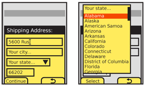
- Select - The "drop-down" or "pull-down" list as seen on desktop and web forms can be placed within a mobile application. When selected, it opens as an anchored layer, allowing scrolling and selection.
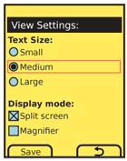
- Radio - Each item in a list is preceded by a line-item selection mechanism, just like a radio button list in desktop or web forms. These work best for vertical text lists. In other cases, they may be un-recognized, or not easily associated with a particular item.

Multiple-select: Used either in-conjunction with other form elements, or as a list on it's own. One, several or all items from a provided list may be selected. Items already selected (or pre-selected by the system) may be de-selected. When all form selections are made a Button or other submission element (such as a Softkey) is used to submit the form.
- Checkbox - Each item in a list is preceded by a line-item selection mechanism, just like a checkbox list in desktop or web forms. Used in-conjunction with other form elements, these work best for vertical text lists, but can be made to work in multiple columns and for other types of selections. For complexly-displayed multiple selections, try the next variation.
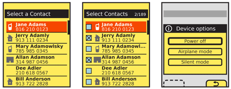
Multiple Select List - A variation of the Select List pattern, where each item displayed has an associated checkbox, allowing selection and deselection.
Single click: Used when there is no form, or this is the only element, a single item may be selected from a provided list. This does not mean it may be the only interactive item on the page. No button is required to submit the form, as the single selection is committed immediately.
Button List - Not radio buttons, but actual form-submission types of Buttons. A list of these can be provided to choose from. Only used for short lists, where no scrolling is required and the action is committed immediately.
Select List - When a longer list is needed, the setting does not take immediate effect or confirmation of the setting should take place inline (by showing the current state in the same display, refreshed) a Select List, usually a simple text Vertical List will serve the purpose.

Interaction Details
Any of the types of Form Selections may be viewed in their passive state at any time, or while not in focus. They may be scrolled through and selected (or deselected, if permissible) while the selection mechanism is in focus.
The definition of focus here may not be entirely clear, but generally does not concern the end user. For the sake of better understanding, the following (somewhat circular) definition will suffice: any time the list can be scrolled through, it is in focus. Examples may help.
A "dropdown" list is not in focus when it appears as a single line. When the field is in focus, it will open to reveal what is functionlly a scrolling, vertical Select List. Whenever the field is in focus, for a scroll-and-select device, one item within the list will be in focus, and using the OK/Enter button will commit the field selection and close the dropdown. For touch or pen devices, no items are in focus, and pointing at an item in the opened list will select and close the list.
- Any list used inline, in the context of a page, such as radio button list can be considered to be in focus at all times. The individual items are selected in the same manner as for dropdown lists, though the list itself does not change, just the selection mechanism.
- Select lists are mostly used full-page, so the list is much like a dropdown, in that it scrolls as a complete list. When a multi-select list, this works like an inline list, and selection only changes the indicator. When a single-select list, it is more like the dropdown list, and closes the list or continues to the next state.
Whenever content is known to the system, or it has been entered by the user previously, it should be pre-selected in the field. Pre-populated content is interacted with just as a user-entered selection, and may be deselected or another selection made.
Presentation Details
Focus of a field and selection item must always be very clearly delineated, with border, background or other effects. See the Focus & Cursors pattern for additional details.
Selection mechanisms should always appear as their intended function. Use current web standards as a heuristic evaluation for the design of such mechanisms; even if OS standard form widgets are used, assure they are understandable to the typical user. Do not mix functions with appearances, such as allowing multiple selections with radio buttons.
Labels should accompany the field whenever space provides, and may be abbreviated or iconic to save space. Labels adjacent to the field should be to the left or above the field, and must be close enough to make the relationship clear. Use regular alignment and designed grids to assure clarity.
Labels may be placed inside the form field itself. This same method may be used, when labels outside the field are provided, for "hint text" to give information on the type or limits of information to be entered in the field. Label or hint text in the field must be clearly differentiated from actual content (whether user-entered or pre-populated). This is usually by language or formatting; "Select a state..." is clearly different at a glance from "Kansas."
Labels in the field are generally selection text, but invalid and should not be submitted (or not have an assigned value, just a label). If hint text is required, such as reasons for entering the information, or clarification about what the information means, it should appear adjacent to the field, below or to the right.
Whenever possible, validate forms at the field level, as they are selected, or when the field looses focus (indicating the user has completed entry). Successful validation can be indicated adjacent to the field, near any hint text. Errors in validation, indicating improper entry, should appear in the same location. The relevant hint text, such as field constraints, can be highlighted if space allows.
Validation may also allow automatic selection of items. For example, on an address form if the user enters a ZIP code (postal code) the corresponding region information may be filled in as well.

Antipatterns
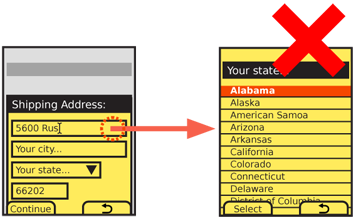
Do not use full-screen input panels as the selection mechanism for small components such as pull-downs. In several OSs or environments selection of any input or select field will display the choices as a full-screen panel. This removes the user from any context, and makes hints and other text invisible. Even if working in such a platform, there are workarounds, so avoid this whenever possible.
Never over-use input methods. If a single Select List or button list is used, do not also have a submit button to commit the action.
Use the right type of selector for the information to be entered. Do not attempt to provide hints on how to multi-select from a pull-down, but use a multi-select mechanism (a checkbox or Select List) instead.
