|
Size: 8423
Comment:
|
Size: 8773
Comment:
|
| Deletions are marked like this. | Additions are marked like this. |
| Line 18: | Line 18: |
| A '''single choice''' is fairly rare, and is only used to inform the user. For example, a fatal error has occurred, and the handset must be restarted. Instead of just doing so, it may be helpful to tell the user that the condition has been reached, so a '''Confirmation''' dialogue is presented, and a single "Restart" button is presented. In cases where the condition is not catastrophic (such as a dropped call) the dialogue may disappear after a brief time. The button then simply dismisses the dialogue that much faster. Some other method (such as loading the call log, and displaying the "dropped call" icon) should present the same message after the dialogue times out. | A '''single choice''' is only used to inform the user. For example, a fatal error has occurred, and the handset must be restarted. Instead of just doing so, it may be helpful to tell the user that the condition has been reached, so a '''Confirmation''' dialogue is presented, and a single "Restart" button is presented. In cases where the condition is not catastrophic (such as a dropped call) the dialogue may disappear after a brief time. The button then simply dismisses the dialogue that much faster. Some other method (such as loading the call log, and displaying the "dropped call" icon) should present the same message after the dialogue times out. A variant of the single choice includes a '''Wait Indicator''' to denote that a process -- usually a user-initated one -- has begun and they must wait to perform other tasks. When possible, include a "Cancel" button. If not, this may become a sort of "no choice" confirmation box, with nothing but messaging and the '''Wait Indicator''' widget in a '''[[Pop-Up]]'''. |
Problem
A decision point is reached within a process where the user must confirm an action, or choose between a small number of disparate (and usually exclusive) choices.

Solution
Try to avoid presenting these conditions to the user. Except for error or guard conditions such as Exit Guard systems can often be designed for avoid explicit choices. For example, when opening a Messaging compose screen, instead of presenting a Confirmation dialog asking whether they intend to compose an MMS or SMS, just open a compose screen with attachment options. If an attachment is chosen, it becomes an MMS. Else, it's an SMS. The choice is still made by the user, but implicitly by actions and choices (selection of the attachments) they needed to make anyway.
Sometimes, these cannot be avoided, and user input cannot be divined contextually. If so, present choices contextually -- usually as a modal dialogue -- simply and clearly communicate the consequences of the choices.
Variations
Though many display methods are possible, all will be modal dialogues of some sort. For more details on these, see variations under Pop-Up.
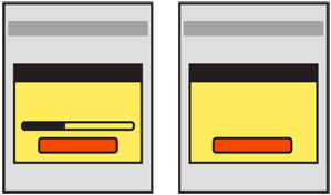 Three key variations exist:
A single choice is only used to inform the user. For example, a fatal error has occurred, and the handset must be restarted. Instead of just doing so, it may be helpful to tell the user that the condition has been reached, so a Confirmation dialogue is presented, and a single "Restart" button is presented. In cases where the condition is not catastrophic (such as a dropped call) the dialogue may disappear after a brief time. The button then simply dismisses the dialogue that much faster. Some other method (such as loading the call log, and displaying the "dropped call" icon) should present the same message after the dialogue times out.
A variant of the single choice includes a Wait Indicator to denote that a process -- usually a user-initated one -- has begun and they must wait to perform other tasks. When possible, include a "Cancel" button. If not, this may become a sort of "no choice" confirmation box, with nothing but messaging and the Wait Indicator widget in a Pop-Up.
By far the most common is two or three choices. This is the maximum number readily comprehended at a glance and presents enough options for most required decisions. Examples of three choices are when exiting with unsaved documents, offer to return to work, save the work and exit and exit without saving. See Exit Guard for more discussion of these sorts of conditions.
In some cases, a larger number of choices must be presented. These will generally be as a list of selections in the dialogue.
Interaction Details
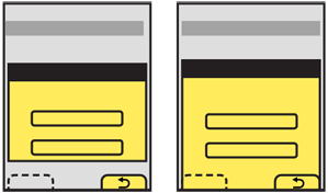 The Confirmation pattern involves an error or choice that stops the process. Such choices should not be avoidable, but should be contextual to make it clear what application, or process they will effect. These should therefore be modal Pop-Up dialogues almost always. See that patterns for additional details.
Whether two or three choices is convenient or requires a non-standard UI is dependent on the OS paradigms. When the device OS uses Softkeys or softkey-like on-screen buttons, then two choices with the dialogue docked to the edge with the buttons is the simplest way to present a small number of options. However, it (usually) limits the options to two.
If additional selections are required, they may be loaded in any way needed, such as buttons in the Pop-Up, as pick lists, etc. Use the Softkeys for primary supporting actions, such as Cancel. In the example above of exiting with unsaved documents, the choices to exit without saving and save documents would be in the dialogue, and the option to return to the application would be labeled "Cancel" and be the Softkey conventionally used for this.
Avoid disregarding Softkeys entirely, for consistency of the interface.
Presentation Details
When the Pop-Up appears, use other methods to notify the user of the stop in process, such as audio and/or vibration. Follow current system volume settings for the notification. Mobiles are used in quick glances, so the user may not notice such a stop in process for minutes or hours unless informed via a non-visual channel.
 If the Confirmation action occurs while an application is running in the background, use any available notification method installed with the OS to bring this to the front. If the only method is a Pop-Up dialogue interrupting the in-focus process, use this carefully. Trivial processes, such as a game crashing, do not need to interrupt phone calls.
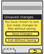
The Title of the dialogue must clearly denote the choice to be made. Do not label it as "Error," with codes or jargon, or with the name of the parent application. For the example used above of exiting with unsaved work, "Unsaved work" would be a suitable title.
A description should usually be provided. If the choices are clear or simple enough, this may sometimes be left out. For the same example a suitable description would be "You have chosen to exit but have made changes to files without saving." The description and title may or may not be questions, as the choices will often serve this role.
Button labels must not depend on the description or title. Never present selections such as "Yes" and "No." At the same time, do not let options be too long, or they may not be readable, or may not look like selections. Options like "Delete" and "Save" are much more suitable. For the same example used previously, options might be:
- "Save changes"
- "Exit without save"
- "Cancel"
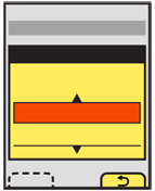 "Cancel" may not seem the most clear label. It is instead a placeholder for the common term or symbol used in the OS to denote canceling or going back from the current action. In this case, the action is the presence of the Confirmation dialogue, so the application will be returned to.
When a choice is clearly the preferred one, or is the safest (e.g. preserves user data), that should be indicated. The OS standards should include a method of indicating button preference such as color, icon use or border treatment.
Antipatterns
Do not over use the single choice variation. For example, if an application must quit and a Confirmation dialogue is useful, a dual choice would usually be better. Offer options to just quit or to quit and restart the same application immediately.
Carefully consider whether a Confirmation dialogue is the right pattern any time more than three choices are offered. It may be a natural part of the process. The use of the modal dialogue implies exceptional conditions or errors so should only be used when needed.
Unless the standard and exclusive way of canceling a process, do not provide a "Close" button for the Pop-Up dialogue. Even if the behavior can be mapped to both the "Close" and "Cancel" functions, the Confirmation dialogue presents options as a set of required choices. Closing the dialogue implies it is optional and can be avoided.
Do not develop new terminology, or use new or non-standard icons for simple behaviors like "Cancel" or "Back." Use the OS standard labels or iconic representations.
