Problem
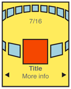 Present a set of information, most or all of which are unique images, for selection.
Solution
A Carousel displays a set of selectable images, not all of which can fit in the available space. It simulates a continuous strip, stack, pile or other arrangement of images, only some of which can be seen at once due to the limited size of the device viewport.
The images presented should be similar in size and aspect ratio. A small amount of additional information about each image can be displayed adjacent to the image as it becomes in focus. In general, the in-focus item is larger, clearly has focus or actions attached to it, etc.
The user can scroll through the set via any number of methods. Indicators should be present, but may not be based on OS standards. Scrolling brings more things in from the sides (or wherever), and changes the item in focus -- must always be live so the items move instead of appearing or jumping.
Variations
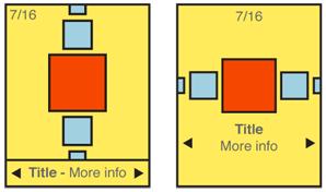
Carousels can be presented either vertically or horizontally. Which one to use depends on the space available in the layout, device display or interaction paradigms, the nature of the items being displayed, OS conventions, and user expectations.
Two dimensional carousels use use size differences to create a simple but false sense of perspective. Two dimensional carousels may overlap the items not in focus slightly, to save space. Images should always be identifiable from the partially exposed image.
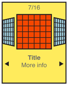
Three dimensional carousels usually make the entire circle of the collection visible by using perspective. When oriented horizontally, the back of the circle is tipped toward the viewer. And contrary to the physical metaphor, the items along the back edge of the display are shown as if the image was on the back of the card, or as if the image was two-sided.
Note that three dimensional carousels can present a more engaging interface, but they can also be a more cluttered and they tend to be more expensive in terms of screen real estate for the display and in processing needed for any image conversion or animation.
Position in the list may be indicated with a conventional pagination widget. The total number of items should be easily obtainable or shown, but other features of the pagination widget may not apply to the particular data set, or presentation.
If the information set can be applied to it well, a location jump widget may be applied. Interactivity of this (accesskeys) will be added to the interactivity of the entire carousel.
Interaction Details
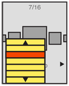
The in focus item is subject to special interaction criteria. Default selection (ok/enter) or options menu selections for a single item will apply to this image.
Generally, any visible image may be selected. The result of selecting an image not in focus may be to bring it to focus, or to carry out the selection action. This is dependent on the context and process in which the carousel is being used.
Scrolling may be by gesture, directional keys, or selection of scroll functions on the screen. Scrolling must always be "live" or show the items moving on the screen. If this cannot be done, do not use the pattern and select another method.
Presentation Details
The item in focus is centered in the screen (or in the array, if the array is off-center for dimensional simulation). It should also be indicated by size, border, labels or other indicators.
Images not in focus should have attributes other than position to indicate they are in a secondary position in the list. Size and angle (skew to simulate not-facing) are the most used.
The last image not in focus, but visible, will imply there are additional images outside the viewport. This may be via size (shrinking to infinity), angle (tilting "up" to become perfectly thin), or by having part of the image not on the screen. Each of these should lead the user to believe there is addition information if they scroll.
Additional scroll indicators are strongly encouraged. Simple arrow/triangle indicators to the sides, or immediately to either side of labels for the item in focus are common. If selectable directly, the indicators should change when selected and while the carousel is moving to indicate their activity.
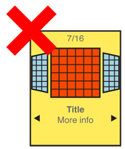
Antipatterns
Preserve the integrity of the image used. Do not use programmatic shortcuts visible to the user:
- If the image is skewed to create perspective, skew the entire image. Don’t clip off corners of the image to simulate a the skew.
- Do not squish the image to change aspect ratio. If needed, add black bars or crop the image to fit a consistent space.
- Do not flip the image when displaying the back of a card, as in 3-dimensional carousels.
Examples
DISCUSS: It is challenging and time consuming to find relevant examples, which then need lots of explanation so everyone understands what we're trying to say. For every other pattern so far, we're just using diagrams. Need to decide which approach. - SSH
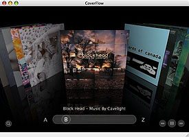
Springboard
|
|
• Many items on screen. |
• Position and skew (perspective) only. |
||
• Position indicator at bottom. |
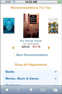
Amazon
|
|
• Horizontal. |
• Linear. |
||
• Scaled. |
||
• No distortion. |
||
• Scroll indicators below. |
||
• Bad: No pagination. |
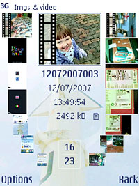
S60 Album
|
|
• Many items on screen. |
• Scale and position only. |
||
• Position indicator at bottom. |
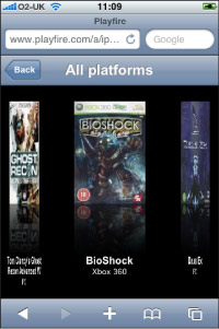
Playfire
|
|
• Images to either side are badly distorted. |
• Lack of perspective makes this unconvincing. |


