Problem
Within any context, an action must be initiated, information submitted, or a state change carried out.

Solution
Use a Button to initiate an immediate action. A button is are not simply a "more important" Link, and should not act as such. Button-like action behaviors may be initiated with an Icon and label pair, if space or other layout or style considerations require it.
Variations
Standalone Buttons will perform an action, or change modes immediately, and with no additional user input:
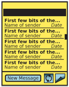
- Switch from email list view to composing a new message.
- Begin to synch email with a remote server. Click again to stop the process.
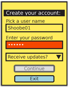
In-conjunction with radio buttons, check boxes or any other user inputs or controls, a Button will commit these user selections. Within websites, buttons are used to submit (or cancel submission of) forms to remote servers:
- With a text field, submits a search.
- With radio buttons, sets the USB connection mode.
With a set of Spinners, saves changes to the time of an alarm.
Delayed input interrupts the submission to request additional user data. Usually, a modal Pop-Up dialogue will be used to retrieve the information. Ellipsis follow the text label of the Button to indicate this condition:
- Share via "Bluetooth, Email, SMS."
See the Exit Guard pattern for a very typical example.

Interaction Details
Depending on the action, the page may or may not change. If there is no change (such as with the synch example above) the button must change state to indicate the process is ongoing, or change the label to the reverse action (e.g. "Cancel Synch").
Buttons may be selected by pressing the OK/Enter key (on a 5-way-pad) when the Button is in focus, or by tapping directly on the Button for touch or pen devices. In many cases, especially in Pop-Up dialogues and full screens where an action is key, a button should be in focus by default.
When user entry is required (for in-conjunction buttons) until sufficient entry has not yet been made, the submit action should be made inactive. This should be communicated with text adjacent to the button.
Presentation Details
Buttons must be very easy to see and activate (especially for touch/pen devices); they are usually about twice the height of the default page text, to provide room around the label. Smaller Buttons can be used for less-important or less-used items, but should never be smaller than about 120% of the vertical size of the smallest text. Consider click target sizes for touch and pen devices, and do not make selection areas smaller than 10 mm.
The width may be fixed, or vary based on the size of the text. Try not to have too much empty space. Vertical size must be the same for equivalent actions. An "OK" and "Cancel" pair, for example, must be the same vertical size.
![]() Buttons should generally appear to be raised above the page slightly. When a button is selected, it should appear to have been pressed and be level with or below page level slightly. Buttons are momentary-contact items, and this activation display should cease when the user click action ceases.
Buttons should generally appear to be raised above the page slightly. When a button is selected, it should appear to have been pressed and be level with or below page level slightly. Buttons are momentary-contact items, and this activation display should cease when the user click action ceases.
For scroll-and-select devices, the button in focus will have a thicker border or other indicator. Inactive buttons must be indicated by being "grayed out." Be sure to select a sufficiently-saturated background and high enough label-to-background contrast that graying out is clear.
Use the writing style already defined for the rest of the OS, your application or your site. Be consistent with capitalization in all Buttons. Be clear about terminology, and avoid labels that require reading. Rarely should buttons say "Submit" or "OK." Descriptive, free-standing labels like "Connect" are always better.
For additional clarity, consider using icons inside the button. Use the most obvious graphic possible, with multiple encoding (e.g. a green check for submit and a red X for cancel). Generally, graphic icons should be to the left of the text, but if direction indicators are used, place the icon to the side indicated. If graphics are not supported, or cannot be relied on (as with low-end web), text entities can be used instead. A selection of reliable ones are:
Icon |
Typical use |
Entity |
Decimal |
Hex |
⊕ |
Add |
⊕ |
⊕ |
⊕ |
⊗ |
Cancel/remove |
⊗ |
⊗ |
⊗ |
√ |
Okay |
√ |
√ |
√ |
⇐ |
Back/prev |
⇐ |
⇐ |
⇐ |
⇒ |
Continue |
⇒ |
⇐ |
⇐ |
Naturally, more common items like "<" or even normal characters like "+" can be used as well.
Antipatterns
Carefully consider whether a series of buttons should be used to make a choice. A more suitable solution is often another type of selection (such as radio buttons) with the Button used to commit the selection. This also allows adding other behaviors, such as a checkbox to indicate the selection should be the default from then on.
Avoid making the default button perform an unrecoverable, destructive action. Users must make deliberate choices instead. See Exit Guard for more on this behavior.
Avoid color schemes that can be misconstrued as being "grayed out," and inaccessible.
