|
Size: 6140
Comment:
|
Size: 6466
Comment:
|
| Deletions are marked like this. | Additions are marked like this. |
| Line 2: | Line 2: |
| The status of hardware features such as battery level and network connections must be able to be discovered by the user with no effort. | The status of important hardware features such as battery level and network connections must be able to be discovered by the user with little or no effort. |
| Line 33: | Line 33: |
| {{attachment:AnnunicatorRow-Batteries.png||align="right"}} | {{attachment:AnnunicatorRow-Batteries.png|A series of exemplary statuses for the battery, from full to empty, then charging. Using the exclamation point in the icon is more clear than blinking, and is a second code for users or conditions where red is not visible. The power plug icon is more clear to many users than the often-used lightning bolt.|align="right"}} |
Problem
The status of important hardware features such as battery level and network connections must be able to be discovered by the user with little or no effort.

Solution
A bar is displayed along the top of every screen with a series of iconic representations of the status of the device. Common representations and placement of icons are used, so users can understand the key indicators on any device without familiarity with the specific device.
Variations
The Annunicator Row is present on all screens. It may only disappear or be of lower prominence when other controls disappear as for full-screen gameplay or video playback.
If the device operates very seamlessly, and has very reliable connectivity (or losses are generally not critical) and long battery life (ePaper devices, and plugged in items like some kiosks or CE devices) then the Annunciator Row may not be needed, and this may be solved with the Notification Area repurposed to display such information when it becomes critical instead. See that pattern for details on this functionality.
Interaction Details
Annunciators are notifiers, like lights and horns of the machine era. They are generally not something with direct interaction.
For touch and pen devices, it may be desirable to allow the user to select the Annunciator Row as a whole, in order to get more information, or to provide access to settings. This may also be accomplished by combining with the Notification Area.
Presentation Details
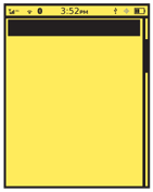
The Annunicator Row is generally displayed as a row of icons laid out on a strip of color, gradient or other background imagery to separate them from other, generally interactive, display elements. Scrollbars do not intrude into the Annunicator Row as it does not move, but remains fixed at the top of the viewport.
![]()
Within the row the status messages are displayed as icons, with as few words or numbers as possible. Use common, universally-understand or industry-standard icons whenever available.
Icons do not indicate the presence of a feature, but the status of that feature. No display means it is not functional, and displaying the icon means it is enabled. Optionally, disabled features may be displayed as "grayed-out" icons. This can be beneficial to communicate the availability of some features. Use caution that these are clearly disabled, under all lighting conditions.
Whenever possible, additional status messages will be carried by the icon, such as bars of signal, or of battery level. Use simple changes and well-understood signaling such as red=bad.
 For certain features, whose presence is assumed, explicit measures of their disabling or failure must be included. For example, when no signal is available, the mobile network will have an error "X" in place of the bars of signal.
Items are grouped by basic functionality. A conventional order has arisen, from left to right:
- Radios:
- Mobile networks.
WiFi.
- Bluetooth enabled, and activity.
- NFC or contactless payment enabled.
- IrDA or other non-wired networking as available.
- Airplane mode.
Input & Output:
- Volume, vibrate or silent modes.
- Screen or keyboard locks enabled.
- Network activity.
- Network speed.
Message Waiting Indicator for voicemail, unless this is displayed by the Notification Area instead.
- Synch status or activity.
- Location services enabled. May or may not indicate when GPS is active.
- USB cable connected.
- Battery:
- Usually a single item, which changes based on charge level, and state (e.g. being charged)
- Those now rare devices with outboard (piggyback) or secondary batteries may display a second battery indicator.
The time of day (and sometimes the date) is also present, but may be in any of several places in the row. The most common is centered, followed by right aligned. Time is always displayed, even on those few devices without an otherwise permanently visible annunciator row.
Naturally, features not included with the device are not given space in the display. Some items may share space, and the highest priority feature or the one with the most important message is displayed.
Antipatterns
Don't let the order or size of the row, or the details of the icons change with different screens. Use one layout and one type of icon in all situations.
Don't reinvent the wheel. Re-use existing good design concepts, so users do not have to re-learn your icons.

Except when notifying of special conditions in places where the rest of the bar is suppressed (e.g. battery on a camera screen), do not pick and choose which items to show. Always show the same set in the same manner.
Avoid explanations that are jargon-laden. Percentage of battery is not nearly as useful as an estimate (even a bad one) of time remaining on a battery.
Avoid animations as sole explanations. Mobiles, and especially the status area, are only glanced at. Blinks will instead be seen as solid on or off at a glance.
