Designing for Touch
Mobile devices are by far the most owned and used connected computing devices in the world. Everyone has a mobile phone, and over half have a touchscreen smartphone.
Over 60% of PCs have touch, and most are convertible tablets. 1 in 4 computers sold run Chrome, an offshoot of Android.
The "normal computer" is now portable and touch first.
We’re past mobile-first, and you should be designing for touch mostly, from interaction, to connectivity, to accounting for glanceability and distraction.
Learn All About Designing for Touch
400 Page Book
Touch Design for Mobile Interfaces published by the Smashing Magazine people in January 2022. Everything you should ever need to know, with references to prove it and find more for yourself.
30 Minute Video
A presentation summarizing the key history, technology, and data, wrapped up with the most important things to keep in mind about how to design for touch first. Presented at Geekle UI/UX Summit ‘22.
Jump straight to my talk near the end of the day.

Touch Target Positions, and Sizes
If you are in too much of a hurry, and just came here because you heard I had the real word on touch target sizes, you can find that without further effort.

The simplest way I can say it is people view and touch the center of the screen the most, the fastest, and the most accurately. Not the bottom, not some thumb-sweep zone. The center. The green blob here is actual touch accuracy data. Summarized:
7 mm at the center
9 mm along the edges
12 mm in the corners.
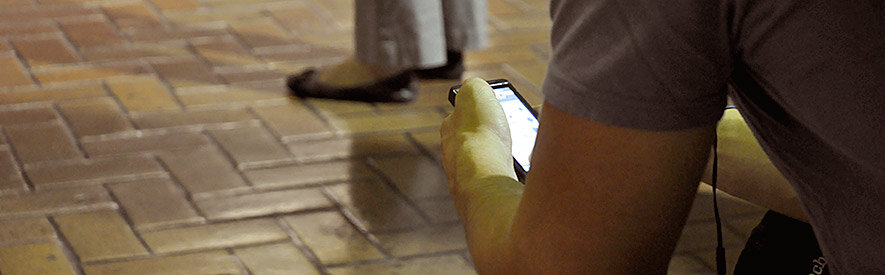
People Hold in Many Ways
You have probably seen that Green/Yellow/Red “thumb zone” chart, maybe even the version I drew over ten years ago as it’s very pretty. But it is wrong.
People don’t carry their phone with one hand, only touch it with their thumb, which somehow stretches?

Instead, we know — from a huge pile of research with millions of captured touches on many devices and contexts — that people shift their grip a lot, between many methods. They change constantly, with no one user strongly preferring one alone, no matter what they think they do.
A little under half of all touches are with one hand. Many other thumb touches are with another hand supporting the phone. Many users hold with one hand, and touch with a finger on the opposite hand. And sometimes, people use both thumbs at the same time.
Type Sizes for Every Device
As devices get larger, such as moving from phone to phablet to tablet, they are used less and less held in the hand. Distance from the eye can therefore be surmised based on device class.
Understanding angular resolution we find that mobile can have smaller type sizes than desktops because they are held closer to they eye. Tablets are used so much on surfaces, we have to treat them like PCs, as far as readability goes.
From that we can calculate basic readable text sizes.

I have a whole table of these suggested sizes — and conversion charts to use it all — in the book, or in this entire, regularly updated report Type Sizes for Every Device.
10 Points to Remember When Designing for Touch
But to design for touch really well, you need to understand these 10 user behaviors, and the accompanying guidelines, to make your designs work for touch and people in the real world:
-
It's easy to make assumptions, and confuse empathy with your own point of view. Your users are not like you, or your friends. And neither are you. We are bad at observing ourselves as well.
• Design for every user.
• Accept that users change.
• Plan for every device.
-
For every portable touchscreen device, user prefer to touch the center of the screen.
• Place key actions in the middle.
• Secondary actions along the top and bottom.
-
Conveniently, this center preference for tapping extends to viewing as well.
• Place key content in the middle.
• Let users to scroll content towards the center
-
Finger size doesn't matter for touch accuracy. But fingers are opaque. They get in the way.
• Make room for fingers around targets.
• Put your content or functions where they won't be covered.
• Leave room for gesture and scroll.
-
Stop saying "fragmentation" as though it is bad. Respect user choice. These devices are different, because people's needs are different, and this is reflected in the way the devices are used.
• Support all input types.
• Predict use by device class.
• Account for distance by adjusting sizes.
-
People are never going to be able to precisely click your target. There's always inaccuracy. But you can account for it in design.
• Make touch targets as large as possible.
• Tap entire containers.
• Design in lists and large boxes.
-
Touch isn't just inaccurate, but it's inconsistently inaccurate. Or at least it seems to be.
• Design by zones; accuracy varies across the screen
• Don't force edge selection, since edges are less accurate
• Leave very large spacing along the top and bottom edges
-
Don't force users to explore your app to find features. But start with what works: Simple controls, that work in expected ways. And the most expected controls are those that are visible, and communicate what they will do.
• Attract the eye.
• Afford action.
• Be readable.
• Inspire confidence.
-
Devices are used by real people, in the real, 3D world.
Design for every environment, and every user.
• Design to work with noise, glare, rain, groceries, and more
• Assume glanceability, and distraction
• Provide room for edge taps and off-screen gestures
-
Size guidelines are fine, but you can help yourself a lot and reduce your math time by just checking your work at scale.
• Paper is your friend.
• Test and demonstrate on real devices.
• Pixels are a lie. Plan accordingly.

Older Articles, Videos, and References
I’ve been writing and speaking on mobile and touch design for over a decade now so I have written a whole lot on design for touch.
I also believe in never deleting anything actually dangerous from the web, so here’s everything older I’ve written as well:
For a somewhat shorter version of the whole touch overview in writing, in 2017 I consolidated everything that I knew for sure about how people touch, and how to design for touchscreens.
It necessarily skips some bits, but nothing in there is inaccurate even with the few years of distance.
Prefer video instead? I have presented it many times. Try one of these:
Steven Hoober - Fingers, Thumbs, and People: Design for How People Touch and Hold Their Devices from Midwest UX on Vimeo.
Need to prove the point in a presentation at work, see my 15 minute SXSW15 Powerpoint or ask me if you need newer references suitable for presentationware.
Some additional articles that informed this, and presentations covering all the content above:
Design for Fingers, Thumbs & People Summary of all this data in ACM Interactions Magazine, Issue XXII.3 May - June 2015, page 48.
Design for Fingers, Touch & People Slideshare of the presentation summarizing everything I know about design for touch.
Design for Fingers, Touch & People YouTube Video of the same presentation. This is probably a better way to consume the above if first being introduced to it.
Phones Aren't Flat: Designing for Real People in Diverse Contexts an article covering context, environment and resilience, with some other interesting data.
Type Sizes for Every Device an article outlining in great detail the type scale principles in the decks, which I often skip past really fast. Here’s where to get that info in detail.
Since my understanding has evolved over time, the older articles and research reports are not always complete. Some people quoting only the older research are therefore not getting the right conclusions. For completeness, here’s my old articles and reports.
Insights on Switching, Centering, and Gestures for Touchscreens UXmatters, September, 2014.
The Rise of the Phablet: Designing for Larger Phones UXmatters, November, 2014.
Making mLearning Usable: How We Use Mobile Devices The eLearning Guild, April, 2014 (paywall).
Common Misconceptions About Touch UXmatters, March 18, 2013.
Design for Fingers and Thumbs Instead of Touch UXmatters, November 11, 2013.
How Do Users Really Hold Mobile Devices? UXmatters, February 18, 2013.
